
Thursday, 24 March 2016
University Firm and Insurance Choices
University Offers
After a busy two weeks of Interviews for each University on the 24th of March i have finally received all of my Offers. All my offers were conditional which mean I had to meet a specific requirement. The condition was that I pass my Art and Design Foundation. My next step now is to Select a Firm and Insurance Choice.

Monday, 21 March 2016
Portfolio - Final Design
Below is my work that I took to my university interviews. The work I mounted on mount board using spray adhesive


To go with the images on the mount board I typed a text description for each piece of work

Tuesday, 15 March 2016
Adobe Xd
On Monday Adobe released the Preview Version of the Project Comet now called Adobe Experiences Design CC
This Is what adobe had to say
Introducing Adobe Experience Design CC (Preview)
On behalf of the Project Comet team, I’m thrilled to let you know that Project Comet has become Adobe Experience Design CC (Preview), or Adobe XD as we refer to it. We’re making our first preview release for Mac OS available today, with a Windows version coming later this year. Everyone can use Adobe XD for free during the preview period – you can download it from Adobe.com or through the Creative Cloud desktop app.

While our team has been working to bring you Adobe XD for some time, this really represents the start of our journey to craft an end-to-end solution for experience design, one that Adobe is committed to undertaking in partnership with the UX design community. We’ve seen how designers think beyond just the visual design of a website or app, but also on optimizing and improving the overall user experience. You can read more about Adobe’s thoughts on Experience Design as a whole here.
For Adobe XD, we’ve received great input from over 5,000 designers as part of our pre-release program and are now excited to get your feedback on our public release as we continue working on Adobe XD.
Adobe XD makes it easy to undertake wire framing, visual design, interaction design, prototyping, previewing and sharing, by bringing together the tools you need for experience design into a single solution. We’re starting by delivering a basic set of tools in each of those areas, with the feedback we receive helping to determine the ultimate set of features that you need, while continuing to ensure we don’t compromise on delivering amazing performance and a comfortable design experience.
What’s in the public preview?
In this first preview release of Adobe XD you’ll find:
- Focused design tools – create wireframes, screen layouts and production-ready artwork
- Prototyping tools – define flows, triggers and transitions as part of your design
- Built in sharing – create a video recording of your prototype or share a link to an interactive prototype hosted on Creative Cloud
- Support for bringing in existing assets from Photoshop, Illustrator and Sketch
- Blisteringly fast performance – create projects that bring together complex designs for web, mobile, tablet, watches and more, without any slow down.
As you get started with the preview release, be sure to check out the sample file available from the start screen, as well as our learn tutorials and documentation.
What’s still to come?
Being a preview release, we’re exposing a work-in-progress. This means you’re likely to find some gaps in the tools and likely wish for increased capabilities in a number of areas. We hope you’ll embrace the opportunity to join us on this exciting journey as we continue making progress on Adobe XD.
Based on the feedback we’ve already received, these are some of the areas that we’ve lined up to work on next:
- Enhanced design features, including support for gradients, richer text, effects and blend modes
- An improved color picker
- Support for working with layers
- More control over the sharing of prototype links
- Authoring of scrollable content
- Micro-interactions for prototyping
- Real-time design preview and prototype testing on mobile devices (iOS and Android)
- Reusability and sharing of design assets and styles, leveraging Creative Cloud libraries
- An extensibility/API layer for plug-ins
- Availability on Microsoft Windows 10 (preview release estimated for late 2016)
Our team will be delivering updates to Adobe XD every month, with a mix of new features, enhancements to existing features and bug fixes, so you’ll see us move fast to deliver these additional capabilities to you as part of Adobe XD.
I then had an Idea for my being human project to design a application that represents what my installation is and it will present the information about being human.

For My Alternative Miss World I am now going to design a live prototype of the Loci Application.
Friday, 11 March 2016
renaissance art composition - Being Human Research 3

Looking at Images: Phi Grid vs. Rule of Thirds
How you frame and crop images can impact engagement and even how a person looking at the image feels about it (whether they know it or not). Here, we’re going to look at two different ways of thinking about images – using the phi grid and rule of thirds — and how you can apply them to your work.
Grids and Science
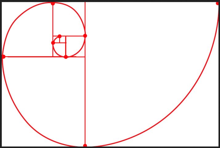
So the key to understanding images and harmony starts with a little science. The Golden Ratio is ones of those bits of science that can be applied to design and images. (And it happens whether you intend to or not.)
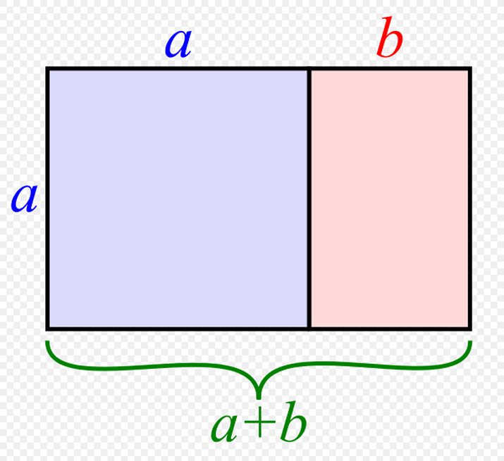
The Golden Ratio is based on the Fibonacci sequence, which was developed by a mathematician in the 12th century. Simply stated, it is a ratio of ideal proportions: 1 to 1.618. The Golden Ratio goes by a handful of other names as well including the golden mean, divine proportion, golden rectangle, extreme mean and phi. It is used across a variety of disciplines such as design, architecture, painting and music and can also be found in nature. When drawn, the Fibonacci sequence is depicted as a spiral within the shape of a perfect rectangle.
This number and “perfect rectangular shape” are important because they form the most pleasing and attractive shape for the human eye. That’s not to say that everything you create will use the Golden Ratio, but it is something to consider when framing and cropping images.
Phi Grid

The Phi Grid helps you visualize the Golden Ratio as a part of each image. It is based on a combination of smaller rectangles in a grid over an image, where four of the rectangles are based on the 1:1.618 ratio.
What you can see when using the Phi Grid is in the spaces where gridlines intersect. These so-called “sweet spots” are places where the eye is naturally drawn in an image. Cropping or aligning an image so that key parts fall in these areas will create focus and harmony.
Pros
- The grid creates visual harmony.
- The grid creates distinct sections on the canvas that aren’t always perfectly symmetrical.
- Works for photos where weight needs to be toward outside edges of the frame.
- Grid creates perfect division of space mathematically.
- You can use the grid lines for alignment and to ensure visual harmony.
- The top horizontal gridline can be great for landscape images and create a horizon line to make cropping easier.
Cons
- The grid can be difficult to create.
- The grid can leave “odd holes” in the eyes of some designers.
- Getting caught up in trying to design on the grid can get frustrating.
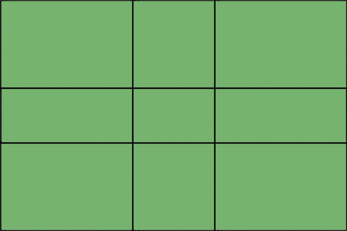
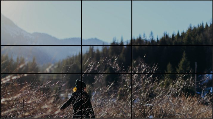
Rule of Thirds
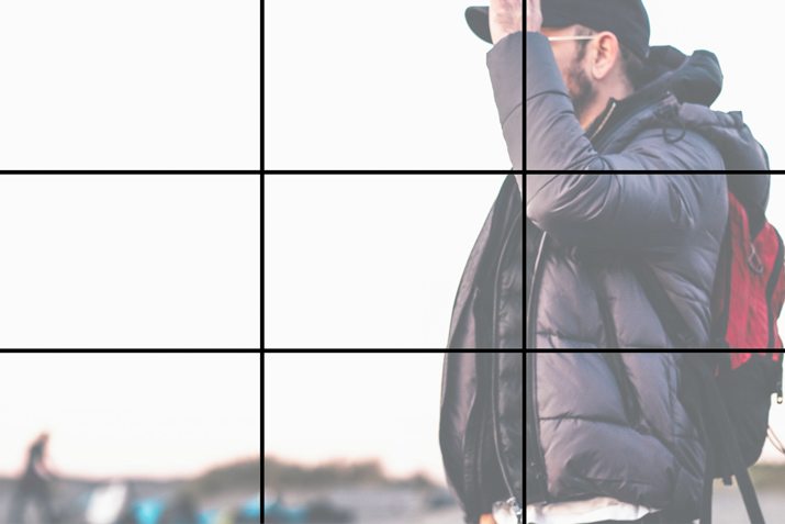
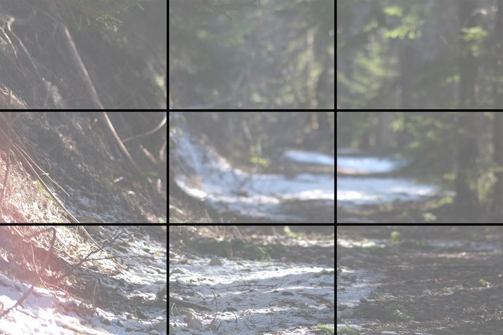
The Rule of Thirds is a more widely recognized image grid that is very much like the Phi Grid. While the origins are not precisely known, it is believed that the concept developed out of a need for a simpler solution to using the Phi Grid.
The Rules of Thirds is a grid that divides any frame into nine equal parts. The corresponding ratio is 1 to 1 per rectangle. So it’s close to the Phi Grid but not precise. The result is a perfectly symmetrical grid that easy to visualize and use. Just like with the Phi Grid, the “sweet spots” are the locations where lines intersect.
Pros
- It is easy to use.
- Standard software, such as Adobe Photoshop, includes rule of thirds cropping guides.
- It creates visual harmony and equal weighting in an image.
- The “sweet spots” are a little larger and easy to find and align.
- The looser variation on the Golden Ratio might feel more natural to some.
Cons
- It’s not mathematically perfect (if you are a stickler for those things).
- It can feel too divided in some instances – depending on the image – or too perfect, because of the forced symmetry.


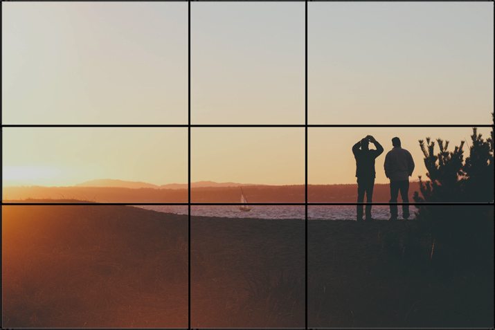

Every image can be overlaid with either grid (look at the images above and compare them using each). Understanding these concepts is less about trying to actively make sure every image uses one or the other and is more about understanding how these things impact what you are doing.
Use these grids as a way to make sure that your images (or logos or illustrations) are as visually sound as they can be. Grids can help you create a foundation for harmony and balance (or lack thereof). Grids can help you tweak an image and crop to a more ideal shape if you feel like something in an image is just off. Grids can help you organize your image and design framework on the canvas.
Tuesday, 8 March 2016
Being Human Research 2
After looking at the different periodic elements the are found within the human body, I then started looking into the different uses of the different elements:
P (Phosphorous) - Matches


P (Phosphorous) - Matches

K (Potassium) - Banana
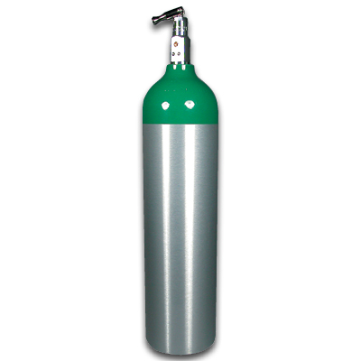
O (Oxygen) - Oxygen Tanks
C (Carbon) - Dimond
H (Hydrogen) - Fuel
N (Nitrogen) - Bulbs
Mg (Magnesium) - Fireworks
Cl (Chlorine) - Swimming Pools
Na (Sodium) - Salt
From this research I can put a twist on the poster collection and say the we are 9.5% hydrogen fuel or 0.4% banana and 18.5% Dimond.
Monday, 7 March 2016
How Edward Johnston became a modern designer
Came across this article on Design Week about - How Edward Johnston became a modern designer
To celebrate the centenary of Edward Johnston’s London Underground font (Johnston Sans), the Ditchling Museum of Art + Craft is launching an exhibition revealing how Ditchling resident Johnston turned from a peripheral arts and crafts figure into a modern designer.
We asked Ditchling Museum of Art + Craft curator Donna Steele to tell this story ahead of the opening of Underground: 100 Years of Edward Johnston’s Lettering for London.

Edward Johnston’s typeface for the Underground Group was in the pipeline for 3 years before being rolled out in 1916, at first on posters and publicity, and then from the early 1920s as station signs. His iconic typeface was designed in the village of Ditchling, and is known variously as Underground or Johnston Sans.
The commission came from Frank Pick, commercial manager for the London Underground Electric Railway, who was looking for a consistent ‘voice’ for the Underground Group; Pick asked Johnston to produce a new typeface with the ‘bold simplicity of the authentic lettering of the finest periods and yet belonging unmistakeably to the 20th century.’
Pick’s masterplan was to create an Underground ‘design fit for purpose’; an Underground whose buildings, graphics and functionality were at the cutting edge of modern design.
Johnston’s typeface, and importantly, his redesigned roundel, sits alongside Charles Holden’s stations, Harry Beck’s tube map, and Marianne Straub’s moquette seat covers as a true icon of the Underground.
From 1933 known as “London’s handwriting”
To travel on the Tube is to travel through a chronology of design classics, but it was in 1933 when the Underground Group became London Transport and Johnston’s typeface was used on bus signs and for the Metropolitan Railways as well, that it began to be known as London’s Handwriting.
On the surface, Johnston, a calligrapher who made his own quills, may not appear a likely candidate for the job, but he was responsible for reviving and redefining calligraphy, a craft that was considered obsolete in the modern age.
His initial training was in medicine but he gave up his studies to pursue a career in the arts. He was already keen on lettering and illuminating, and in 1898 artist Harry Cowlishaw who had encouraged him, introduced Johnston to W R Lethaby, principal of the newly founded Central School of Arts & Crafts. Lethaby was looking to introduce illumination to the curriculum, and he had now found his man. He sent Johnston off to study manuscripts at the British Museum, and Johnston took up his teaching post in 1899.
Edward Johnston and William Morris
Johnston was on the coat tails of William Morris who had responded to industrialisation by looking back to medieval craft guilds. The shock of new ideas, and difficulty to process change, is often responded to by being nostalgic, and to idealise the future, but Morris’s work was so labour intensive that it was prohibitively expensive for working class people and actually worked against his socialist principles.
Johnston’s belief in ‘truth to materials’ heralded the way forward by shifting the emphasis away from decoration. His teaching of lettering to a new generation of craft workers was in the tradition of the medieval guilds but it was also in the context of a modern learning establishment. Johnston was not a fan of industrialisation either, but his passion for lettering extended to type; it was after all a tradition that dated back 500 years.
Far from being nostalgic though, Johnston applied the proportions of his beloved Roman capitals from the Trajan column to his modern typeface and to this end he absolutely achieved Frank Pick’s vision for a pioneering corporate branding for London’s Underground.
100 years of Edward Johnston’s Lettering for London runs from 12 March – 11 September 2016 at Ditchling Museum of Art + Craft, Lodge Hill Lane, Ditchling, East Sussex, BN6 8SP


Friday, 4 March 2016
Being Human Research 1
After writing my statement of intent for this project I started looking at the build up of the human body focusing on the Skeletal Structure, organ systems, muscle structure and nervous system


Then I had an idea about looking at the different periodic table elements that are found within the human body.
Periodic Table
I found this diagram showing the different periodic elements in the human body which also shows the percentages of the different elements.
A current graphic design trend of 2016 is geometry design and then when I started looking at the electron structure, I wondered what shapes I would be able to create by putting connecting all the electrons together for each of the elements would create.
Subscribe to:
Comments (Atom)