Showing posts with label Typography. Show all posts

Wednesday, 29 June 2016

Johnston 100 Posters

To celebrate 100 years of the iconic London Underground typeface, designed by Edward Johnston in 1916. Designers have been creating posters:


Tuesday, 28 June 2016

Johnston 100


To celebrate 100 years of the iconic London Underground typeface, designed by Edward Johnston in 1916

As with Pick’s original brief to Johnston, TfL’s brief to Monotype was simple to say but deceptively difficult to achieve: Ignore New Johnston. See if it is possible to go back to Johnston’s original typeface and work from that. Take it as the base, fill in the gaps and add then add the extra weights now needed to use Johnston effectively online, on mobile and elsewhere.

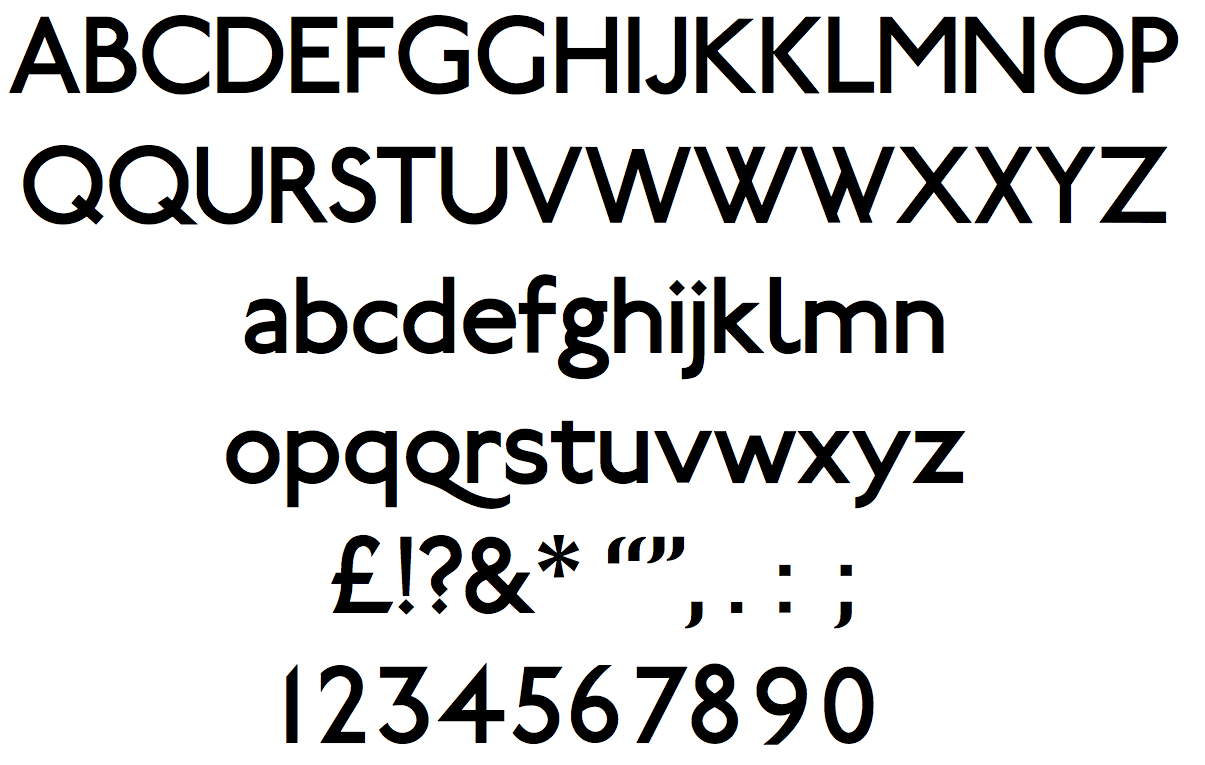
The results of Monotype’s effort is the newly-christened Johnston100 which has added two new weights, thin and extra thin and has a number of other technical tweaks that set the typeface up properly for modern usage. 

The johnston typeface presence expands beyond in stations to digital mediums including apps and social media, the updated typeface known as Johnston100 contains subtle changes to make it fit for purpose in the 21st century. This includes never-before designed symbols, such as # and @, which are now widely used in an environment where digital communications are as important as print.

Johnston100 Hairline and Johnston100 Extra-thin

Johnston100 Thin, Johnston100 Regular and Johnston100 Medium


Interestingly the biggest way in which the typeface had changed over the years, however, was in its width. The Monotype team discovered that, over the years, Johnston had gradually become narrower. The changes were always marginal and thus it wasn’t obvious from revision to revision. Comparing the current iteration of New Johnston with Edward Johnston’s original work though it was surprisingly clear that over the course of its hundred year history the difference was substantial. Johnston100 restores much of the original width, and the overlayed text below shows just how noticable the difference is.
Overlaying Johnston100 over New Johnston highlights the differences in character width. Notice the far wider ‘h’.

When looking and comparing the Johnston sans, New Johnson and Johnson 100 you can see the development in the design of from Johnson Sans typeface to the New Johnson typeface the developed  the x-height, width and height ratio, weight of the letters and default spacing between. Also  Eiichi Kono used the diamond shape for the punctuation for the New Johnston typeface. From the New Johnston typeface to the Johnston 100 typefaces has developed the weights of the letters similar to the Johnston sans typeface, the addition of new characters sure to social media developments with to use of the # and the @. Johnston 100 typeface kept the diamond shape for the punctuation.  

Thursday, 21 January 2016

London Underground Map Research

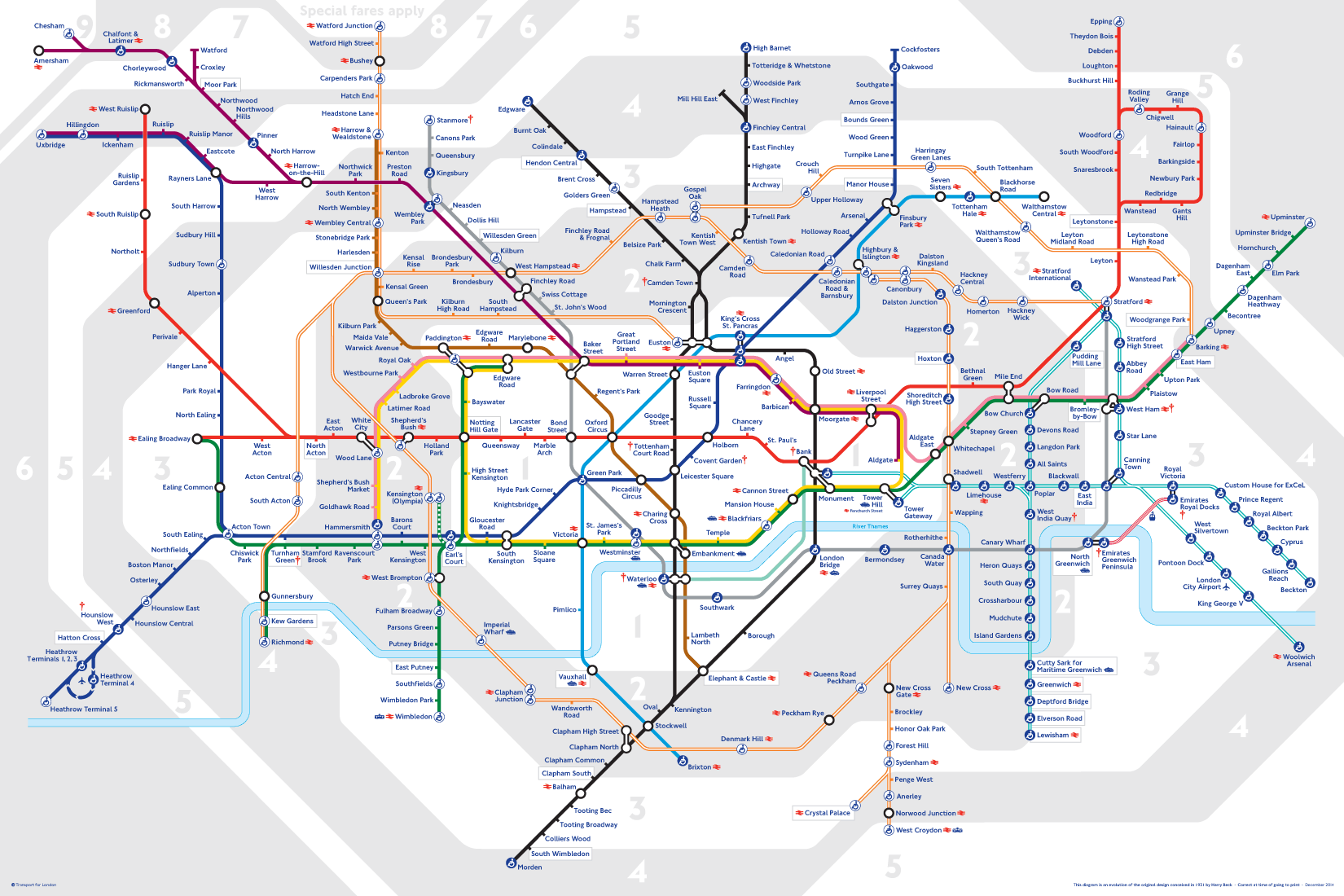
Now recognised across the world, the Tube map was originally the brainchild of Underground electrical draughtsman, Harry Beck, who produced this imaginative and beautifully simple design back in 1933.
Rather than emphasising distance and geographical accuracy, like other maps, Beck based his on the circuit diagrams he drew for his day job; stripping the sprawling Tube network down to a neat diagram of coloured, criss-crossing lines.
Beck's map was initially rejected by the publicity department because it was considered too radical but a successful trial print-run showed that it was just what the public wanted. 
The result was an instantly clear and comprehensible chart that would become an essential guide to London - and a template for transport maps the world over.
Beck's revolutionary design, with certain modifications and additions, survives to the present day and is set to serve London Underground and its millions of customers for many years to come.

The History Behind the London Underground Map and design

1907 - Introduced the Trade Mark of a solid red roundel. Which is a simple geometric design which was used to standardise the signage of the underground for example the Covent Garden Station shows how the red White and blue palette Appeared to a commuter. However there was little attention paid to marketing the underground in a constant matter

Edward Johnson

1916 - typographer was commissioned 'Edward Johnson' who Designed a new Typeface for the tube which was an eponymous face (names After Himself ) Johnson Sans. The plain block letters demonstrate almost no variation in stroke width. Created lettering that would be legible in the blink of an eye from a passing train. It was important to Johnson that the lettering provided the same sense of glamour and modernity that the abstract promotional poster emphasised.

Johnson Sans

1918 - Johnson was commissioned again to update the roundel and expand on its possibilities as the basis of signage. Johnson updated the design by transforming the solid red circle into a white circle with a red band around it, a bulls eye. and both outlining both the redound and the bar that cuts across the roundel with a strong black contour line. The most important update was a change in the proportions between the bulls eye and the bar, making the former smaller so that it no longer visually overwhelmed the bar and lettering on it. He also added his typeface to the logo. 


The reconfigured bull's eye was to be come one pf the most recognisable trademark ever invented.
Harry Beck

1930 - Harry Beck was commissioned to devise a simple but comprehensive map of the different routes. He based his work on diagrams of electric circuits, which use colour and geometry simplify  a more complex and variable system. Beck created a map in between 1931 and 1933that displayed the tentacles of the system in a logical, predictable diagram


The map was first introduced as a leaflet, the finished map rapidly became one of the most famous examples information management ever divided 
Beck successfully reduced the irregular layout of the system into a grid-based design that showed each route on a horizontal, vertical, or diagonal axis. Each station and interchange  was clearly marked. Beck's innovation has proved to be a lasting one, as similar maps are still used in subway systems around the world. 

The London Underground map 2016


Tuesday, 1 December 2015

Contextual Studies - What I'm getting out of it

Over the weeks of contextual I have found that looking into the different eras of the art and design history I have found that I can look at different types of art movements such as dada and bauhaus for example. Although the main subject areas might not be graphic design however I have noticed that the different movements of art and design have influenced graphic design today and the different techniques used within graphic design (typography. Looking at René Magritte work for example has influenced the advertisement, logos ect 
The Son of Man, 1946 by Rene Magritte
The Son of Man

Rene Magritte influenced advertisement for a Volkswagen. Still used within advertisement today 


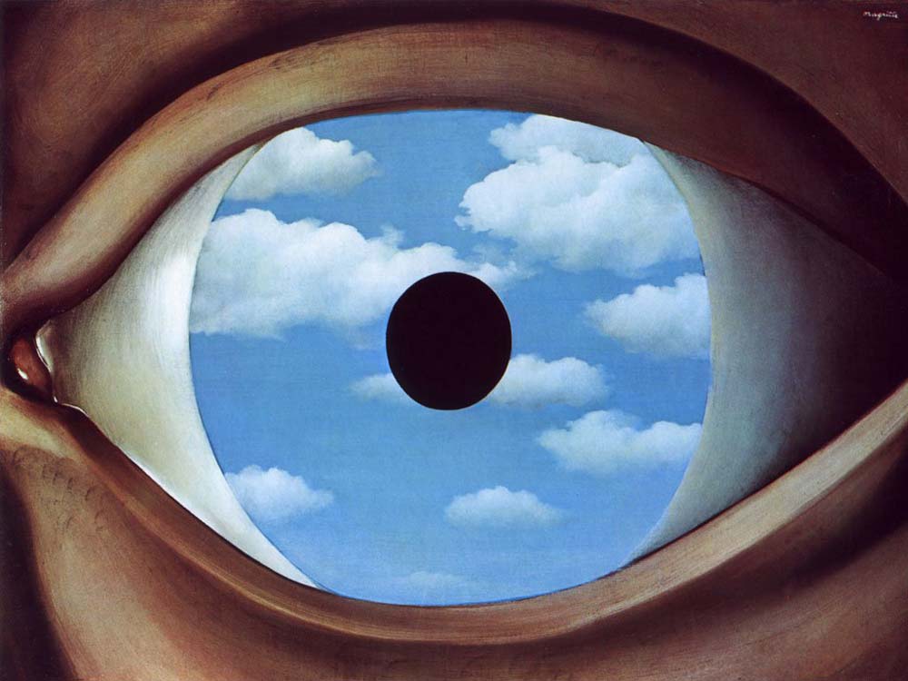
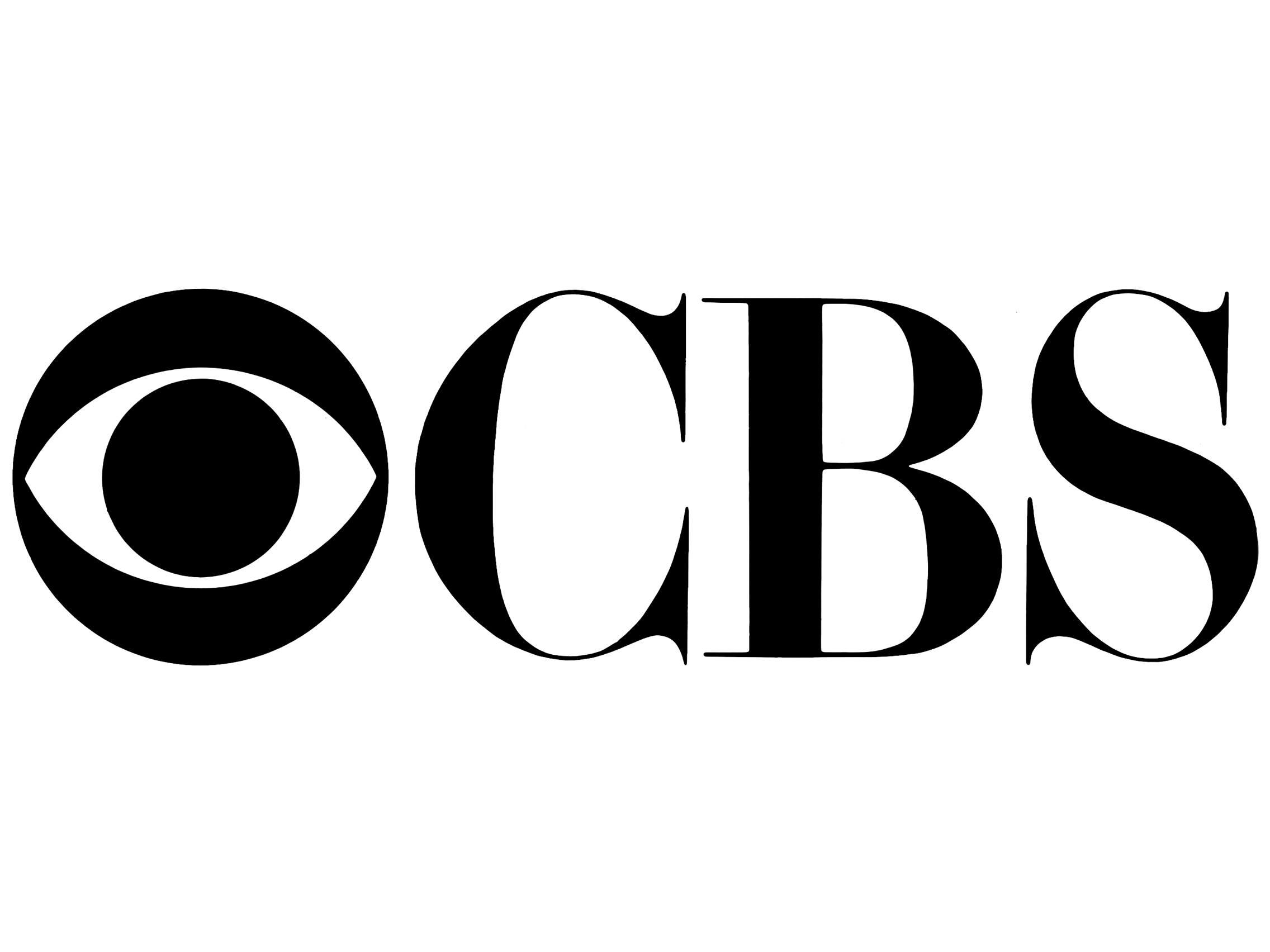
The false Mirror was the influence for the CBS logo 
DADA has influenced typography and Photo Montage


From the Contextual research this allows me to see how graphic design has developed and how I can use the contextual references within my own work.

Looking into how the course I'm currently studying (Art and Design Foundation) and how it os based on the Bauhaus Manifesto 

Thursday, 26 November 2015

Alternative Miss World Research


Alternative Miss World 

Theme  - Letters and Numbers  

For the theme I can use the letters and numbers to create a from of Typography & Monotype design 

Visual Communication and Digital technologies: Produce a range of advertising and design work that encourages an audience of your age range to become involved with the themes relating to the AMW on a daily basis. This could include corporate identity advertising and rebranding for the show; to sell costumes from the show; to sell the essence of the show. 

From the brief I am going to rebrand the show and create posters of advertisement for the alternative miss world with the theme of words and numbers. So I gathered together previous show posters and looked at the numbers and letters used throughout the  posters. 


Text that I would include on the poster would be:

Andrew Logan

Alternative Miss World 

Date (March 2016)

Theme (Words and Numbers)

To present our design development to reaching the final design I will create a video scribing  showing the different stages of my design development. 

Below is a video from a trial I did for video scribing about Adobe CC


Tuesday, 24 November 2015

Contextual Studies #7

Degenerate Art

Degenerate Art promoted paintings and sculptures that were traditional in manner and that exalted the "blood and soil" values of racial purity, militarism, and obedience. "modern art" had no place in Nazi Germany.

At the time disapproved music was termed degenerate music (such as Jazz), films and plays also were censored.

In 1933 when Hitler rises into power he burned books an artists and musicians were dismissed from teaching positions, and creators who had shown partiality to modern art  because hitler was trying to cleanse the culture of degeneracy

Bauhaus Was closed


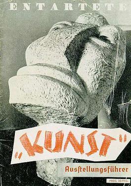
Cover of the catalogue of the Nazi "Degenerate Art" exhibition (1937). The exhibition was held to defame modern and Jewish artists.


Nazi Poster entartete musik poster Degenerate Music
Jewish Composers and Jazz/Swing musicians were accused by the Nazis to produce "degenerated music"


Degernerate Art Exhibition - Munich 1937


Max Beckmann (February 12, 1884 – December 27, 1950) was a German painter, draftsman, printmaker, sculptor, and writer. 

The Nazi government called Beckmann cultural Bolshevik an he was dismissed from teaching position at an art school
Max Beckmann Self-portrait with Horn, 1938-1940


Tuesday, 17 November 2015

Contextual Studies #6


Bauhaus

Link to Pinterest

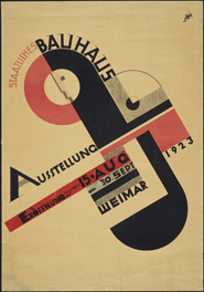
The Bauhaus was a school whose approach to design and the combination of fine art and arts and crafts proved to be a major influence on the development of graphic design as well as much of 20th century modern art. Founded by Walter Gropius in Weimar, Germany in 1919, the school moved to Dessau in 1924 and then was forced to close its doors, under pressure from the Nazi political party, in 1933. The school favored simplified forms, rationality, functionality and the idea that mass production could live in harmony with the artistic spirit of individuality.

Along with Gropius, and many other artists and teachers, both Laszlo Moholy-Nagy and Herbert Bayer made significant contributions to the development of graphic design. Among its many contributions to the development of design, the Bauhaus taught typography as part of its curriculum and was instrumental in the development of sans-serif typography, which they favored for its simplified geometric forms and as an alternative to the heavily ornate German standard of blackletter typography.

Bauhaus Manifesto
   U67

Walter Gropius created the Staatliche Bauhaus in Weimar in 1919 from the merger of the Grand Ducal Saxonian school of arts and crafts, where Henry van de Velde was director until 1915, and the Grand Ducal Saxonian school of arts. Immediately after he took office as director, Gropius had a four-page pamphlet printed. He put Feininger’s Cathedral woodcut on the front page and included both the founding manifesto and a detailed teaching program in the content. This is where Gropius announced his school’s seminal aim: architecture, sculpture and painting were to lead back to the crafts. The name “Bauhaus” was selected for its allusion to the masons’ guilds of the medieval cathedrals, which combined art and craft in the collaborative undertaking, the “grand building”.

S03
Cathedral
Feininger’s cubist woodcut, "Cathedral", was made in 1919 for the cover of Walter Gropius’s manifesto and programme for the Staatliches Bauhaus Weimar. Here, Gropius and Feininger referred to the “miracle of the Gothic cathedral” as a Gesamtkunstwerk (total work of art). The name “Bauhaus” subsequently evolved as an allusion to the medieval masons’ guilds.
S01

Manifesto and Programme of the State Bauhaus
The Bauhaus’s incantatory ‘Manifesto’ formed part of the prospectus in which Walter Gropius presented the programme of the newly founded college of design in 1919, using Lyonel Feininger’s ‘Cathedral’ woodcut as the title image. The Bauhaus Director’s proclamation focuses on the need for the fine arts to be unified under the primacy of architecture and for a return to craftsmanship in order to reveal the ‘craft quality’ as the ‘ultimate source of creative design’.
S02

Manifesto of the Staatliches Bauhaus in Weimar April 1919

“The ultimate goal of all art is the building! The ornamentation of the building was once the main purpose of the visual arts, and they were considered indispensable parts of the great building. Today, they exist in complacent isolation, from which they can only be salvaged by the purposeful and cooperative endeavours of all artisans. Architects, painters and sculptors must learn a new way of seeing and understanding the composite character of the building, both as a totality and in terms of its parts. Their work will then re-imbue itself with the spirit of architecture, which it lost in salon art.

The art schools of old were incapable of producing this unity – and how could they, for art may not be taught. They must return to the workshop. This world of mere drawing and painting of draughtsmen and applied artists must at long last become a world that builds. When a young person who senses within himself a love for creative endeavour begins his career, as in the past, by learning a trade, the unproductive “artist” will no longer be condemned to the imperfect practice of art because his skill is now preserved in craftsmanship, where he may achieve excellence.

Architects, sculptors, painters – we all must return to craftsmanship! For there is no such thing as “art by profession”. There is no essential difference between the artist and the artisan. The artist is an exalted artisan. Merciful heaven, in rare moments of illumination beyond man’s will, may allow art to blossom from the work of his hand, but the foundations of proficiency are indispensable to every artist. This is the original source of creative design.

So let us therefore create a new guild of craftsmen, free of the divisive class pretensions that endeavoured to raise a prideful barrier between craftsmen and artists! Let us strive for, conceive and create the new building of the future that will unite every discipline, architecture and sculpture and painting, and which will one day rise heavenwards from the million hands of craftsmen as a clear symbol of a new belief to come."

I am Currently Studying the Foundation of Art and design and the cause structure is based on the Bauhaus Manifesto

The images below are of artwork that has influenced Graphic Design


Here below are videos I watched During the lesson which is a Bauhaus Documentary


Wednesday, 11 November 2015

London Trip

On Wednesday the 11th of November I visited london for the UCAS Fair for Art and Design courses, I got information from the University of Cardif, Sheffield Hallam University, Nottingham Trent Universtiy, University of Linclon. After the UCAS Fair i went to have a look round the tate musum and then the science and national history museums. the imges below are from the Tate Modern Museum where I have got inspiration for my Alternative Miss World Projec that I am currently working on at college becasue of the letters and numbers.  The images of the plane and pop art design I have recently been looking at half tone effects to use within my work so I took an mge zoomed in to the shadowing of the pop art images and found that they had used a combination of blue dots and red dots, and from a distance it looks like one solid colour.