After looking over my worksop map poster I found that the route to the Alternative Miss World wasn't very clear and was hard to see. I also found that the poster was confusing the user wouldn't understand the purpose of the poster and what the different shapes and forms mean. So a key would be useful for the design. When editing the Worksop poster map I added a key to the bottom left hand corner of the poster. I also found that when I removed the roads under the path from North Notts College to the Notts Arena the red path wasn't very easy to see. As a result I used the yellow orange colour to make the route stand out within the poster. The boarder of Worksop the thick red line I found was very overpowering and was drawing the attention of viewers away from the content within the boarder. So I reduced the thickness of the boarder.
I then changed the colour of the water to a lighter blue to make it standout clearer within the design.
I then went back and looked at the London uUnderground Map
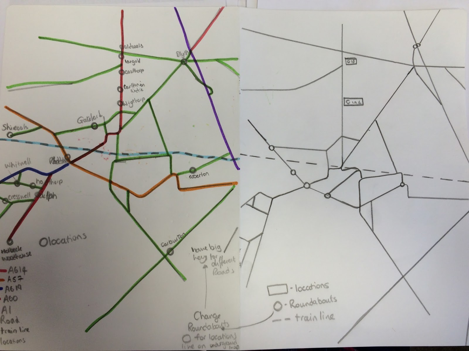
So I decided to look at my Worksop road map and make the roads be more like vertical and horizontal lines. Which I first sketched into on to paper without the Worksop boarder.
Looking at the work I could see a variety of shapes created by the road lines and thought wha would the map look like with the different shapes coloured in, within the worksop boarder.
The image above shows the shapes coloured in using the roads of Worksop
The image above shows the shapes coloured in using the roads of Worksop and the route for the Alternative Miss World event from North Notts College to the Notts Arena.
Looking at the images I found that the map roads wasn't very clear and was going away from the purpose of the poster. So I then added all of the roads within the Worksop boarder.
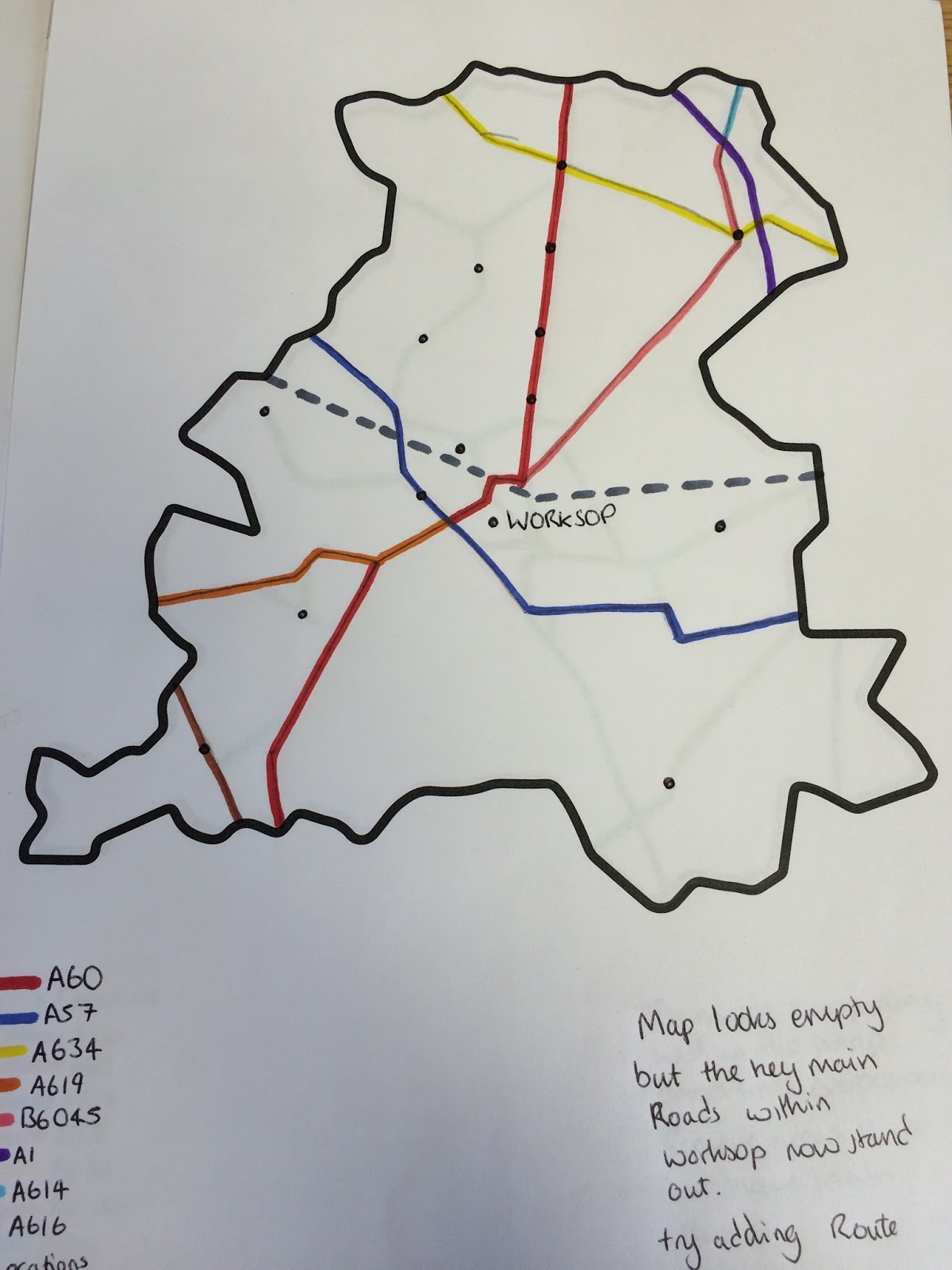
However I found that there was too much going off within the map and the green roads are too overpowering. So I then drew the roads within the boarder and coloured them in for both alternative miss world worksop map and Just for the Worksop roads on two separate pages using only the main roads and the roads used as part of the route to the event.
1) Alternative Miss World Route
2) Worksop Roads
Looking at both of the maps I found that the map looks empty but the main roads within Worksop now stand. I then moved on to Adobe Illustrator and Drew both maps 1 & 2.
After looking at the map of just the Worksop roads I wanted the poster to be different in size not just either A3 / A4 ect so I reduced the height of the page by moving the map, and key up the page.
I found that this suited my poster design because it was very compact.
I then looked at the Alternative Miss World Route Map on Adobe Illustrator
When I Looked at both maps together I found that I could develop the Worksop Road Map further so I will now look at how I can develop the Worksop Road Map (Shown Below).
From the Worksop map I believe that I could create a brand from the Design. I will also look into the history behind the London Underground Map.