Showing posts with label underground. Show all posts

Monday, 7 March 2016

How Edward Johnston became a modern designer


Edward Johnston, Design for an alphabet, 1916 (V&A E 47 1936). Victoria and Albert Museum, London.
Edward Johnston, Design for an Alphabet, 1916 (V&A)

Edward Johnston’s typeface for the Underground Group was in the pipeline for 3 years before being rolled out in 1916, at first on posters and publicity, and then from the early 1920s as station signs. His iconic typeface was designed in the village of Ditchling, and is known variously as Underground or Johnston Sans.
The commission came from Frank Pick, commercial manager for the London Underground Electric Railway, who was looking for a consistent ‘voice’ for the Underground Group; Pick asked Johnston to produce a new typeface with the ‘bold simplicity of the authentic lettering of the finest periods and yet belonging unmistakeably to the 20th century.’
Pick’s masterplan was to create an Underground ‘design fit for purpose’; an Underground whose buildings, graphics and functionality were at the cutting edge of modern design.
Johnston’s typeface, and importantly, his redesigned roundel, sits alongside Charles Holden’s stations, Harry Beck’s tube map, and Marianne Straub’s moquette seat covers as a true icon of the Underground.

From 1933 known as “London’s handwriting”

To travel on the Tube is to travel through a chronology of design classics, but it was in 1933 when the Underground Group became London Transport and Johnston’s typeface was used on bus signs and for the Metropolitan Railways as well, that it began to be known as London’s Handwriting.
On the surface, Johnston, a calligrapher who made his own quills, may not appear a likely candidate for the job, but he was responsible for reviving and redefining calligraphy, a craft that was considered obsolete in the modern age.
His initial training was in medicine but he gave up his studies to pursue a career in the arts. He was already keen on lettering and illuminating, and in 1898 artist Harry Cowlishaw who had encouraged him, introduced Johnston to W R Lethaby, principal of the newly founded Central School of Arts & Crafts. Lethaby was looking to introduce illumination to the curriculum, and he had now found his man. He sent Johnston off to study manuscripts at the British Museum, and Johnston took up his teaching post in 1899.

Edward Johnston and William Morris

Johnston was on the coat tails of William Morris who had responded to industrialisation by looking back to medieval craft guilds. The shock of new ideas, and difficulty to process change, is often responded to by being nostalgic, and to idealise the future, but Morris’s work was so labour intensive that it was prohibitively expensive for working class people and actually worked against his socialist principles.
Johnston’s belief in ‘truth to materials’ heralded the way forward by shifting the emphasis away from decoration. His teaching of lettering to a new generation of craft workers was in the tradition of the medieval guilds but it was also in the context of a modern learning establishment. Johnston was not a fan of industrialisation either, but his passion for lettering extended to type; it was after all a tradition that dated back 500 years.
Far from being nostalgic though, Johnston applied the proportions of his beloved Roman capitals from the Trajan column to his modern typeface and to this end he absolutely achieved Frank Pick’s vision for a pioneering corporate branding for London’s Underground.
100 years of Edward Johnston’s Lettering for London runs from 12 March – 11 September 2016 at Ditchling Museum of Art + Craft, Lodge Hill Lane, Ditchling, East Sussex, BN6 8SP


way-out
Edward Johnston, Way Out, Brompton Road, 1916, Ditchling Museum of Art + Craft
bukks-eye
Edward Johnston, Bulls Eye, no date, Crafts Centre
E.584-1999 Poster Defacing Posters; London Transport poster asking people not to deface posters; Britain. Edward Johnson (1825-1896), of font London Transport; Baynard Press England Colour offset lithography on paper
Edward Johnston, Defacing posters, V&A.
Edward Johnston at his desk

Wednesday, 27 January 2016

Alternative Miss World Feedback.

On twitter I posted my Worksop road underground theme map which I typed;


Which I received the following responses from my twitter followers and others on twitter and the impressions is still rising.


Next I will post the coffee cup, T-shirt design and mobile application design on twitter to see what response they get.

Mobile Application - Loci

For my Mobile application I had to come up with a name for the application and then design a logo and the artwork for the application.

After thinking of a name I came up with Loci because the application is about locations  (LOC) and about locations you have visited making it personal to the user (I).

After Filling two layout pads I looked at the locations marker and looked at making the text the outline of the location marker which looked like this:


I then used the logo and a section of the Worksop road map to design the artwork for the application. 


Friday, 22 January 2016

Alternative Miss World Update 2

From designing the Worksop road Map I then looked at different merchandise that has been created for the London Underground and came across a mug, scarf, bedding and a phone case.


After looking at these images I designed a Coffee Cup Design and a tshirt design. 

I got the idea from a Costa Coffee cup which I had earlier that day so I used Adobe Illustrator to design the layout of the cup from my design that I had recorded on a layout pad.


Here is the layout I designed in Adobe Illustrator


This design I then transferred  into a mock up of the Coffee Cups showing what the design would look like if it got printed. For the background I used a cropped image of the worksop map.


I then designed a t-shirt design. I first designed the t-shirt on a layout pad and then used a mock up to show what the t-shirt would look like if it was printed.


To design something different I will now look into how to create and design a Mobile application.

Wednesday, 20 January 2016

Alternative Miss World Update


After looking over my worksop map poster I found that the route to the Alternative Miss World wasn't very clear and was hard to see. I also found that the poster was confusing the user wouldn't understand the purpose of the poster and what the different shapes and forms mean. So a key would be useful for the design. When editing the Worksop poster map I added a key to the bottom left hand corner of the poster. I also found that when I removed the roads under the path from North Notts College to the Notts Arena the red path wasn't very easy to see. As a result I used the yellow orange colour to make the route stand out within the poster. The boarder of Worksop the thick red line I found was very overpowering and was drawing the attention of viewers away from the content within the boarder. So I reduced the thickness of the boarder. 


I then changed the colour of the water to a lighter blue to make it standout clearer within the design. 


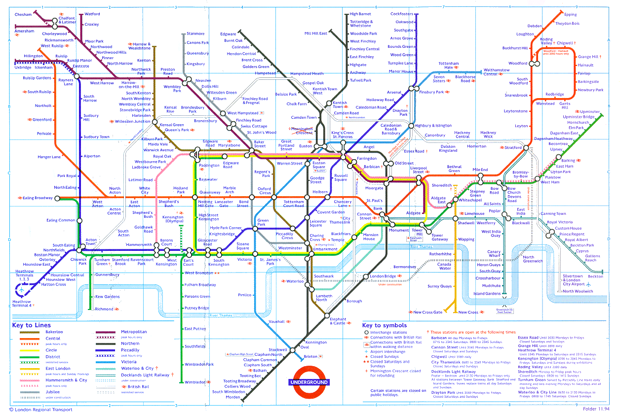
I then went back and looked at the London uUnderground Map 


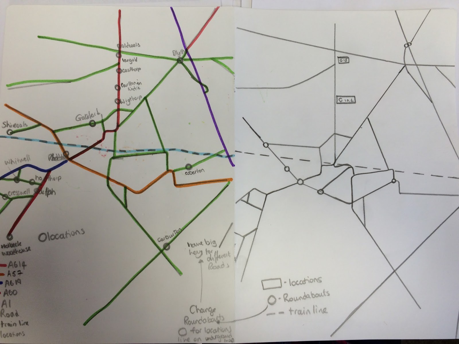
So I decided to look at my Worksop road map and make the roads be more like vertical and horizontal lines. Which I first sketched into on to paper without the Worksop boarder.


Looking at the work I could see a variety of shapes created by the road lines and thought wha would the map look like with the different shapes coloured in, within the worksop boarder.


The image above shows the shapes coloured in using the roads of Worksop


The image above shows the shapes coloured in using the roads of Worksop and the route for the Alternative Miss World  event from North Notts College to the Notts Arena. 

Looking at the images I found that the map roads wasn't very clear and was going away from the purpose of the poster. So I then added all of the roads within the Worksop boarder.


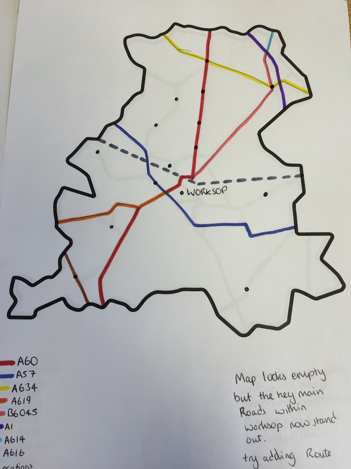
However I found that there was too much going off within the map and the green roads are too overpowering. So I then drew the roads within the boarder and coloured them in for both alternative miss world worksop map and Just for the Worksop roads on two separate pages using only the main roads and the roads used as part of the route to the event.

1) Alternative Miss World Route


2) Worksop Roads


Looking at both of the maps I found that the map looks empty but the main roads within Worksop now stand. I then moved on to Adobe Illustrator and Drew both maps 1 & 2.


After looking at the map of just the Worksop roads I wanted the poster to be different in size not just either A3 / A4 ect so I reduced the height of the page by moving the map, and key up the page.


I found that this suited my poster design because it was very compact.

I then looked at the Alternative Miss World Route Map on Adobe Illustrator


When I Looked at both maps together I found that I could develop the Worksop Road Map further so I will now look at how I can develop the Worksop Road Map (Shown Below).


From the Worksop map I believe that I could create a brand from the Design. I will also look into the history behind the London Underground Map.

Monday, 4 January 2016

Alternative Miss World Poster Design

After researching looking into the Alternative Miss world in my previous post (Click Here) I started looking at maps of worksop (where the SeWhat Event is held) but i found it hard to find maps of just worksop so I started to look for a postcode map. Worksop is S80 and S81 


From this map I was able to see the shape of worksop. I then extended my search and looked at what was within each postcode zone and came across these maps one for S80 and another for S81

S80


S81

After putting the map of the area of worksop together and I started to look at the presentation of different transport Methods map such as the underground and bus routes however I found that their route designs was too complicated for the small scale worksop route I and planned. 


So i worked on just putting the major roads through worksop and the main roads used within worksop. 
Roads Such as the 
-B6463
-A634
-A614
-A60
-A57
-A619
-A616
-A1

I first sketched them out on a printed version of the worksop area


Which I then build on Adobe Illustrator


I then worked out a long route you could take through worksop instead of going the quickest route like you normally would continuing down the theme of alternative miss world. 


After adding place markers i then needed to come up with a design for the North Notts College Location and The North Notts Arena so I went and looked at the transporting company logos such as First Travel, Underground, Stagecoach.


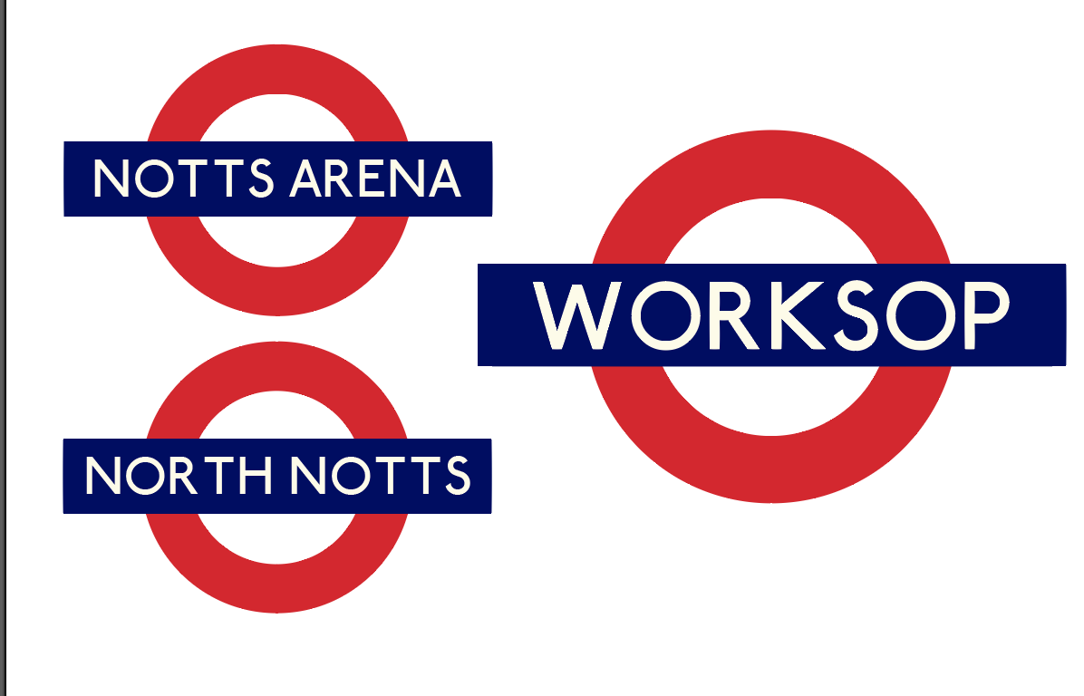
The Underground logo I found really caught my eye, so I used the colours of the logo and the font (which i downloaded from Here) to create one that said Worksop, North Notts (college) and Notts Arena


I then placed the Notts arena and North notts Above the markers on the map and found that I didn't need the red circle in the underground logo I can just use the marker as the red shaped background. 


I then used the colour theme throughout my poster to create this initial poster.