For my next university project design Principles we have been asked to produce blog about our work and research using a Wordpress site that has been set up for us by the university. The link is posted below:
Thursday 6th / Friday 7th October (Week 11) - In the HPO Building - Like Letters Over the two days, we were split into groups and we had set times to partake in different activities. Activity 1 Like Letters ‘Like Letters’ is a project inspired by Fiona Woodcock's & Joanna Rucklidge's mutual appreciation for typographic forms. The project borrows from the concept of written exchanges & love letters. The letters are 'posted' every two weeks - the responses are a direct 'reply' to the previous design. The visual dialogue captures the 'to & fro' of ideas, craft & character. The alphabet of 26 letters includes upper & lower case, and the project is running neatly for 52 weeks, starting on June 1st 2014. to find out more about like letters here is the blog page for the Like Letters Project. http://like-letters.tumblr.com For this activity, we had to pick a letter from Fiona Woodcock's & Joanna Rucklidge's exhibit and using the theme for that letter create our own version of the net letter in the alphabet. I picked the letter C
And designed the letter D
Activity 2 Love Letters For this activity, we were each given a page with consisted of the letters of the alphabet and an instruction to Add or remove. We were then given a Keyword, of which we had to follow to either add or remove to the letter. If you had Add as your instruction you used a black marker and if you had remove you had a White marker. The sheets we then passed around clockwise each person working on a different letter. below are examples of some of the sheets that was passed around. Alphabet Disruption.
Activity 3 Crit Activity 3 was an opportunity for us within our groups to discuss our thoughts about our sketchbook and initial ideas for the project, and ask any questions related to the project. Activity 4 Mutant Letters Was a self-guided activity where we had to use letterforms and merge them together to create an image and different letter forms. (I currently have not Images of my work Due to Submission for this module.)
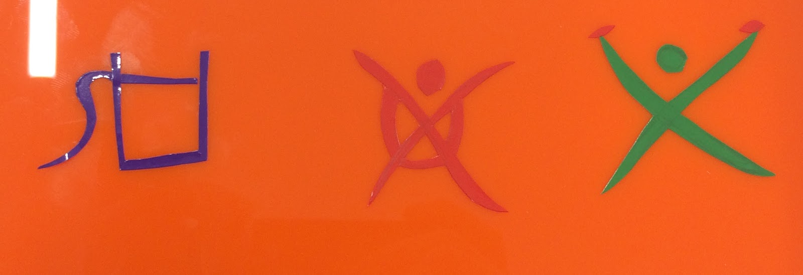
Monday 10th October Week 12 - in the HPO Building - Visual Translations. In Monday's session we looked at the Linear A and Linear B scripts and using ink we painted a selection of the scripts symbols and looked at how they could be used visually to communicate within this project. After painting the Linear Scripts we then had to design out our own related to our experiences within Sheffield so far. Once we had designed out symbols we had to then cut them out using vinyl stickers stick them onto a piece of acrylic and also carve them into the clay.
My first Symbol was about Drinking.
My second Symbol was about beating Jack at a sumo wrestling
My final symbol was about going climbing.
Tuesday 11th October (Week 12) - In the HPO Building - Drawing Workshop
In Monday's session, we looked at drawing different letter forms using our senses. we had to listen to different letter forms being described and had to draw what we thought the letter was that was being described. Using touch we had letters in black bags which we had to figure out what the hidden letter was. Using sweats shaped as letters we had to use our tongue to figure out what the letter the sweat was shaped as.
After the break, we then watched a Documentary about Helvetica by Gary Hustwit
Film, about graphic design, typography and in general, about the global visual culture we live in. The film is centred around the popular font Helvetica that in 2007 turned 50 years old. Interviews with renown designers around the world such as Erik Spiekermann, Matthew Carter, Massimo Vignelli, Wim Crouwel, Hermann Zapf, Neville Brody, Stefan Sagmeister.
Thursday 13th October (Week 12) - In the HPO Building - Printmaking Workshop
In this session, we used different methods of creating letterforms using ink in various different ways. I currently have no images of my work due to having to submit my work to be assessed. When My work is available I will update this blog post.
Friday 14th October (Week 12) - In the HPO Building - Briefing
With this module coming to a close we had a briefing on how to present our final alphabet and where we need to submit our work on Monday the 17th October.
We were then presented with an additional brief to complete by the 1st November.
Communication Brief
As a group, discuss & agree in what ways you can communicate a message and/or intervention in Sheffield. Build on the knowledge & research you have gained about Sheffield, to develop an opinion about Sheffield that you will communicate in a typographic format of your choice. Use all the skills & experiences you have brought with you from past courses, and build on the skills gained whilst working with research, image-making & type during the Design Principles module. Employ all these tools to convey a typographic message/statement/question etc in an appropriate format and relevant environment of your choice.
Day 5 Monday 3rd October (Week 11) - In the HPO Building - Alphabet City Alphabet City Working with different letter forms on Monday we were given a sheet of tracing paper which consisted of a grid with 5 columns and 3 rows. we had 3 exercises to carry out: Exercise One:
Select a lower case letter from the alphabet – using the 5 frames, trace it, but amend elements of it to create a narrative based on the word ‘STRETCH’ Exercise Two: Select an Upper case letter from the alphabet – using the 5 frames, trace it, but amend it to describe a narrative based on the word ‘SHRINK’ Exercise Three: Select another letter & using Upper and lower case – using the 5 frames, trace them & morph them, to describe a narrative based on the word ‘DESTROY’ What I did is shown below:
After the First set of exercises, we were given another sheet of tracing paper which only had two rows and 5 columns.
Exercise Four:
Trace any lowercase letter in square 1, and trace a different uppercase letter in square 5. By tracing elements from both, create a visual narrative that travels from one to the other. Exercise Five: Think of a 5 letter word that describes your experience/definition of Sheffield. By tracing the 5 letters explore how we could write the word, that characterises the meaning of it.
Exercise Six: How do you want to define Sheffield? This task was to amend all the letters in the word ‘SHEFFIELD’ to create a unified word. We were given a choice of the word Sheffield typed in different forms to trace (Upper & Lower / serif/sans serif). We were also given sheets of black and white silhouettes of different things that can be found in Sheffield to help amend the word Sheffield to create a unified word.
What I did is shown below:
Day 6
Tuesday 4th October (Week 11) - In the HPO Building - Light Letters
Anatomy of type
The session started with a presentation about the anatomy of type. We then were showed an example of type work by Ed Fella which showed that each character fo our alphabet doesn't have to have a set theme throughout but each individual character could have its own theme and the type will still look good when put together with other characters to form words.
Light Letters
From a selection of different letters (Upper & Lower / serif/sans serif), we had to select one letter and look at the anatomy of that letter and draw it onto a sheet of A5 paper. I choose the Letter K:
After looking at the anatomy of the letter we then, Using acetate, design the letter using up to 4 colours (primary and Green) to show the different parts of the anatomy of the K.
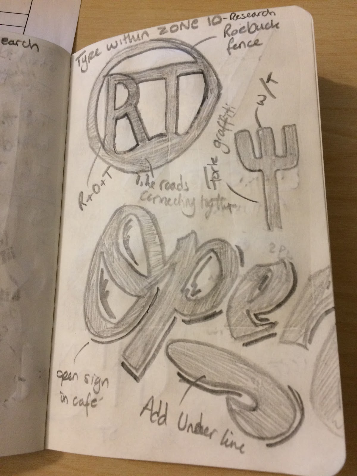
For the next task, we had to use inspiration from the research gathered so far about our assigned zones (Zone 10) and design a letter using the Acetate to present the letter.
What Next...
Thursday 6th October - In the HPO Building - Like Letters
Friday 30th September - HPO Studio - Sketchbook Review
Sketchbook Review
To start the session, we had to get in a line in the order of the number of syllables that we had in our name. I had a total of 3 syllables (Callum Shutt). We were then split into different groups with peers who had been allocated different zones and shared our sketchbooks to see how we all work differently within our sketchbooks and what they had found within our different zones. After looking at each other's sketchbooks and other groups we were then tasked with writing five words / phrases that best describes the current sketchbook that you was looking through.
In our groups, we then had to create a list of what we thought was the most important words / phrase that best described what sketchbook should be. we had 40 words to narrow down to the top 5:
1.Personal
2.Observational
3.Good research
4.Good use of technique
5.Interesting Ideas
A keyword I got out of this task was Personal because everyone works differently within their sketchbook using different mark making materials, annotation, images. Even the size of the sketchbook is personal.
Then we had to create yet another list of what not to do in a sketchbook:
1.Leaving Blank pages
2.Decorating pages (adding borders)
3.Pointless annotations
4.Covering up mistakes
5.Mixing project work with personal work
Before I started college and started to use a sketchbook I always removed and covered up my mistakes from my work but I have found that mistakes are good because they show how your designs have developed and can help inspire other designs in the future.
From looking at other people's sketchbooks within the session I am going to have a go at using different mark making materials, as all I am currently using is a pen and a pencil. I am also going to do some quick observational drawings.
What Next...
Monday the 3rd October (Week 11) - In the HPO Building - Alphabet City
In my self directed study time I am going to look round the Millennium Gallery and do the typographic tour of Sheffield
Link below is about the typographic Tour of Sheffield
Thursday 29th September (Week 10) - Zone 10 - Collecting
Zone 10 - Research
Today we was tasked to generate a body of research using as many different devices for translating our experiences and observations of all the type you find in our zone, whilst recording and establishing what characters we notice in our assigned area of Sheffield. Walking around my assigned zone I came across all ranges of type forms, and street art which i have recorded doing the following: Images
Sketchbook
From my images I have then sketched the type into my sketchbook and annotated what parts of the design of the type I like and would then look at developing the different styles into the different characters that I have got to design.
Colour Themes
From the Roebuck Pub (1), The Plug (2), Building (3) and the Patrick Moore image (4) I have used Adobe Capture to extract the colours theme. The colour themes are then available to access within the Libraries tab within the Adobe Creative Cloud Softwares workspace. I really like the colour theme for the Roebuck Pub. Collecting the colour themes will allow me to have a range of colour swatches from my zone making it more related to my assigned area of Sheffield.
Collected Objects
Within zone 10 there is the A.P.G Works Art Gallery where I found a series of flyers with different forms of type presented within.
Zone 10 - Group Meeting
All the students who have been assigned Zone 10, we had to meet Jenni Whitehead at the Cantor Building Cafe on Arundel Street. We had to share our sketchbooks to show each other what we had found from our zone. Everyones was different because we all record our findings in different ways. For example, taking images, sketching in our sketchbooks, rubbings and collecting different objects
What Next...
Friday 30th September - In the HPO Building - Sketchbook Review
Continue to research into type and doing sketches in my sketchbook.