Showing posts with label london. Show all posts

Wednesday, 27 January 2016

Mobile Application - Loci

For my Mobile application I had to come up with a name for the application and then design a logo and the artwork for the application.

After thinking of a name I came up with Loci because the application is about locations  (LOC) and about locations you have visited making it personal to the user (I).

After Filling two layout pads I looked at the locations marker and looked at making the text the outline of the location marker which looked like this:


I then used the logo and a section of the Worksop road map to design the artwork for the application. 


Sunday, 24 January 2016

Maynards and Bassetts unite to form new “adult candy” Brand

Confectionery brands Maynards and Bassetts have been brought together under one identity to form a new “adult candy” brand.

The newly formed Maynards Bassetts brand is operated by Mondelez International and features confectionary including Wine Gums and Liquorice Allsorts. The new Maynards Bassetts masterbrand has been created by Bulletproof. Bulletproof are a design agency based in London, New York and Singapore. They have also designed all the packaging for the new brand.


Bulletproof has created a new Maynards Bassetts “plaque” that can sit on the packs. The consultancy describes the new plaque as “a conduit where the intrinsic values of the products tumble in through the top and out again, turning into a wonderful, colourful and dynamic flavour slide that delivers the sweets or characters, such as Bertie, in a dynamic and exciting way.” As well as redesigning the packaging for existing Maynards Bassetts ranges, Bulletproof has also created designs for a new product – Bertie’s Jelly Mix. The new packaging is set to roll out next month.


Friday, 22 January 2016

Alternative Miss World Update 2

From designing the Worksop road Map I then looked at different merchandise that has been created for the London Underground and came across a mug, scarf, bedding and a phone case.


After looking at these images I designed a Coffee Cup Design and a tshirt design. 

I got the idea from a Costa Coffee cup which I had earlier that day so I used Adobe Illustrator to design the layout of the cup from my design that I had recorded on a layout pad.


Here is the layout I designed in Adobe Illustrator


This design I then transferred  into a mock up of the Coffee Cups showing what the design would look like if it got printed. For the background I used a cropped image of the worksop map.


I then designed a t-shirt design. I first designed the t-shirt on a layout pad and then used a mock up to show what the t-shirt would look like if it was printed.


To design something different I will now look into how to create and design a Mobile application.

Thursday, 21 January 2016

London Underground Map Research

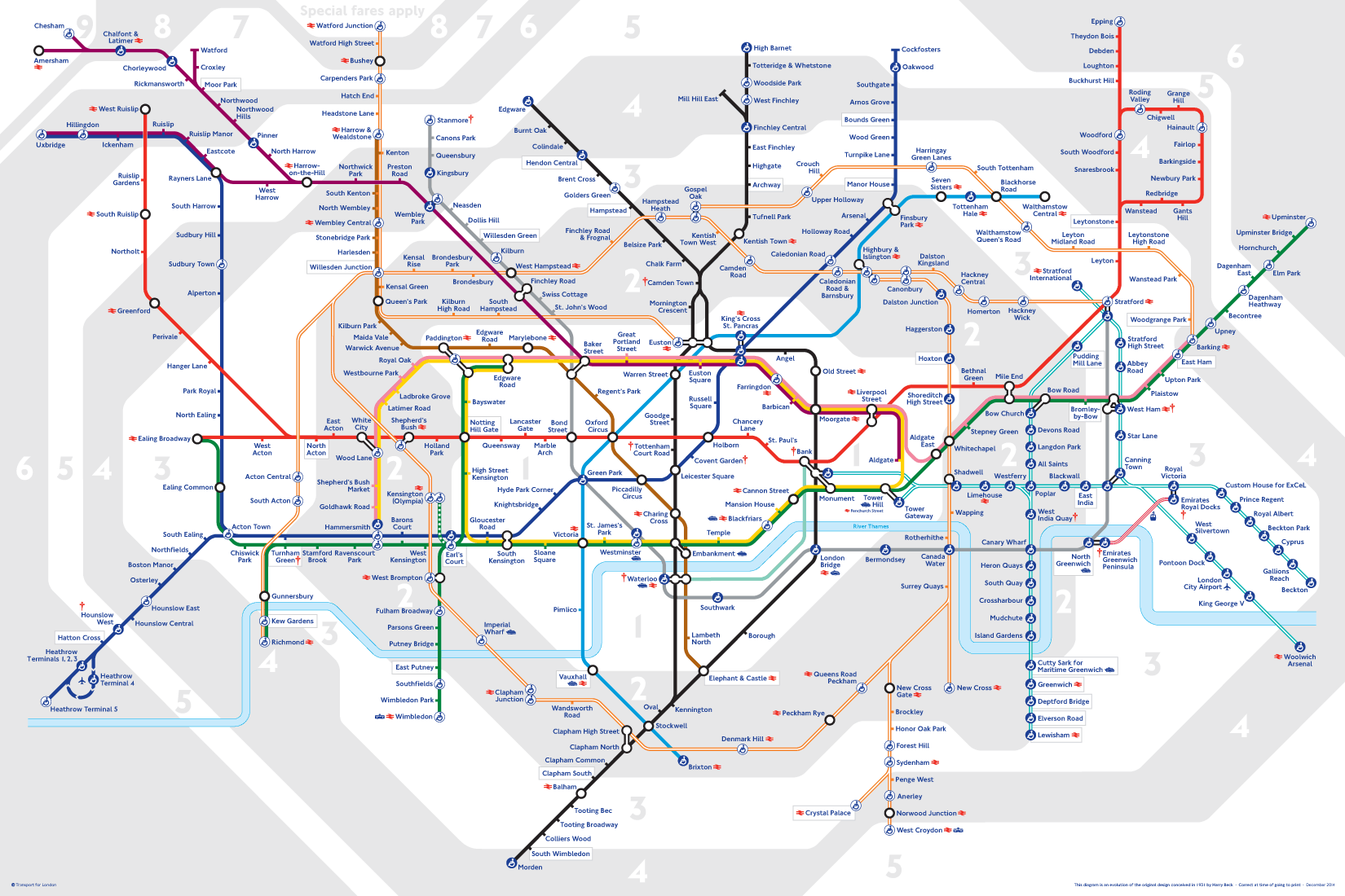
Now recognised across the world, the Tube map was originally the brainchild of Underground electrical draughtsman, Harry Beck, who produced this imaginative and beautifully simple design back in 1933.
Rather than emphasising distance and geographical accuracy, like other maps, Beck based his on the circuit diagrams he drew for his day job; stripping the sprawling Tube network down to a neat diagram of coloured, criss-crossing lines.
Beck's map was initially rejected by the publicity department because it was considered too radical but a successful trial print-run showed that it was just what the public wanted. 
The result was an instantly clear and comprehensible chart that would become an essential guide to London - and a template for transport maps the world over.
Beck's revolutionary design, with certain modifications and additions, survives to the present day and is set to serve London Underground and its millions of customers for many years to come.

The History Behind the London Underground Map and design

1907 - Introduced the Trade Mark of a solid red roundel. Which is a simple geometric design which was used to standardise the signage of the underground for example the Covent Garden Station shows how the red White and blue palette Appeared to a commuter. However there was little attention paid to marketing the underground in a constant matter

Edward Johnson

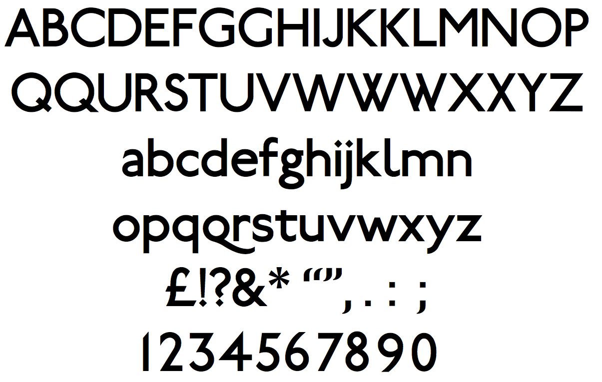
1916 - typographer was commissioned 'Edward Johnson' who Designed a new Typeface for the tube which was an eponymous face (names After Himself ) Johnson Sans. The plain block letters demonstrate almost no variation in stroke width. Created lettering that would be legible in the blink of an eye from a passing train. It was important to Johnson that the lettering provided the same sense of glamour and modernity that the abstract promotional poster emphasised.

Johnson Sans

1918 - Johnson was commissioned again to update the roundel and expand on its possibilities as the basis of signage. Johnson updated the design by transforming the solid red circle into a white circle with a red band around it, a bulls eye. and both outlining both the redound and the bar that cuts across the roundel with a strong black contour line. The most important update was a change in the proportions between the bulls eye and the bar, making the former smaller so that it no longer visually overwhelmed the bar and lettering on it. He also added his typeface to the logo. 


The reconfigured bull's eye was to be come one pf the most recognisable trademark ever invented.
Harry Beck

1930 - Harry Beck was commissioned to devise a simple but comprehensive map of the different routes. He based his work on diagrams of electric circuits, which use colour and geometry simplify  a more complex and variable system. Beck created a map in between 1931 and 1933that displayed the tentacles of the system in a logical, predictable diagram


The map was first introduced as a leaflet, the finished map rapidly became one of the most famous examples information management ever divided 
Beck successfully reduced the irregular layout of the system into a grid-based design that showed each route on a horizontal, vertical, or diagonal axis. Each station and interchange  was clearly marked. Beck's innovation has proved to be a lasting one, as similar maps are still used in subway systems around the world. 

The London Underground map 2016


Wednesday, 20 January 2016

Alternative Miss World Update


After looking over my worksop map poster I found that the route to the Alternative Miss World wasn't very clear and was hard to see. I also found that the poster was confusing the user wouldn't understand the purpose of the poster and what the different shapes and forms mean. So a key would be useful for the design. When editing the Worksop poster map I added a key to the bottom left hand corner of the poster. I also found that when I removed the roads under the path from North Notts College to the Notts Arena the red path wasn't very easy to see. As a result I used the yellow orange colour to make the route stand out within the poster. The boarder of Worksop the thick red line I found was very overpowering and was drawing the attention of viewers away from the content within the boarder. So I reduced the thickness of the boarder. 


I then changed the colour of the water to a lighter blue to make it standout clearer within the design. 


I then went back and looked at the London uUnderground Map 


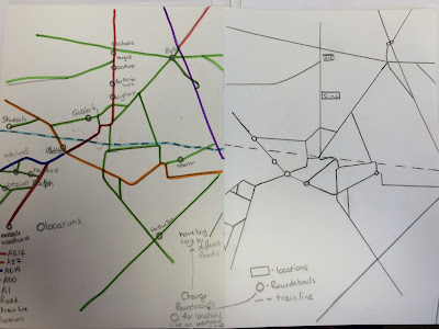
So I decided to look at my Worksop road map and make the roads be more like vertical and horizontal lines. Which I first sketched into on to paper without the Worksop boarder.


Looking at the work I could see a variety of shapes created by the road lines and thought wha would the map look like with the different shapes coloured in, within the worksop boarder.


The image above shows the shapes coloured in using the roads of Worksop


The image above shows the shapes coloured in using the roads of Worksop and the route for the Alternative Miss World  event from North Notts College to the Notts Arena. 

Looking at the images I found that the map roads wasn't very clear and was going away from the purpose of the poster. So I then added all of the roads within the Worksop boarder.


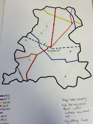
However I found that there was too much going off within the map and the green roads are too overpowering. So I then drew the roads within the boarder and coloured them in for both alternative miss world worksop map and Just for the Worksop roads on two separate pages using only the main roads and the roads used as part of the route to the event.

1) Alternative Miss World Route


2) Worksop Roads


Looking at both of the maps I found that the map looks empty but the main roads within Worksop now stand. I then moved on to Adobe Illustrator and Drew both maps 1 & 2.


After looking at the map of just the Worksop roads I wanted the poster to be different in size not just either A3 / A4 ect so I reduced the height of the page by moving the map, and key up the page.


I found that this suited my poster design because it was very compact.

I then looked at the Alternative Miss World Route Map on Adobe Illustrator


When I Looked at both maps together I found that I could develop the Worksop Road Map further so I will now look at how I can develop the Worksop Road Map (Shown Below).


From the Worksop map I believe that I could create a brand from the Design. I will also look into the history behind the London Underground Map.

Wednesday, 11 November 2015

London Trip

On Wednesday the 11th of November I visited london for the UCAS Fair for Art and Design courses, I got information from the University of Cardif, Sheffield Hallam University, Nottingham Trent Universtiy, University of Linclon. After the UCAS Fair i went to have a look round the tate musum and then the science and national history museums. the imges below are from the Tate Modern Museum where I have got inspiration for my Alternative Miss World Projec that I am currently working on at college becasue of the letters and numbers.  The images of the plane and pop art design I have recently been looking at half tone effects to use within my work so I took an mge zoomed in to the shadowing of the pop art images and found that they had used a combination of blue dots and red dots, and from a distance it looks like one solid colour.