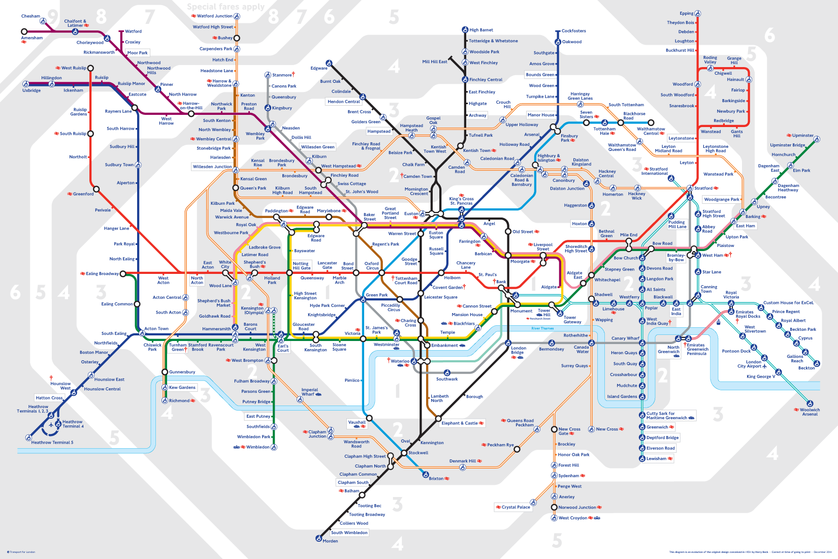
Now recognised across the world, the Tube map was originally the brainchild of Underground electrical draughtsman, Harry Beck, who produced this imaginative and beautifully simple design back in 1933.
Rather than emphasising distance and geographical accuracy, like other maps, Beck based his on the circuit diagrams he drew for his day job; stripping the sprawling Tube network down to a neat diagram of coloured, criss-crossing lines.
Beck's map was initially rejected by the publicity department because it was considered too radical but a successful trial print-run showed that it was just what the public wanted.
The result was an instantly clear and comprehensible chart that would become an essential guide to London - and a template for transport maps the world over.
Beck's revolutionary design, with certain modifications and additions, survives to the present day and is set to serve London Underground and its millions of customers for many years to come.
The History Behind the London Underground Map and design
1907 - Introduced the Trade Mark of a solid red roundel. Which is a simple geometric design which was used to standardise the signage of the underground for example the Covent Garden Station shows how the red White and blue palette Appeared to a commuter. However there was little attention paid to marketing the underground in a constant matter
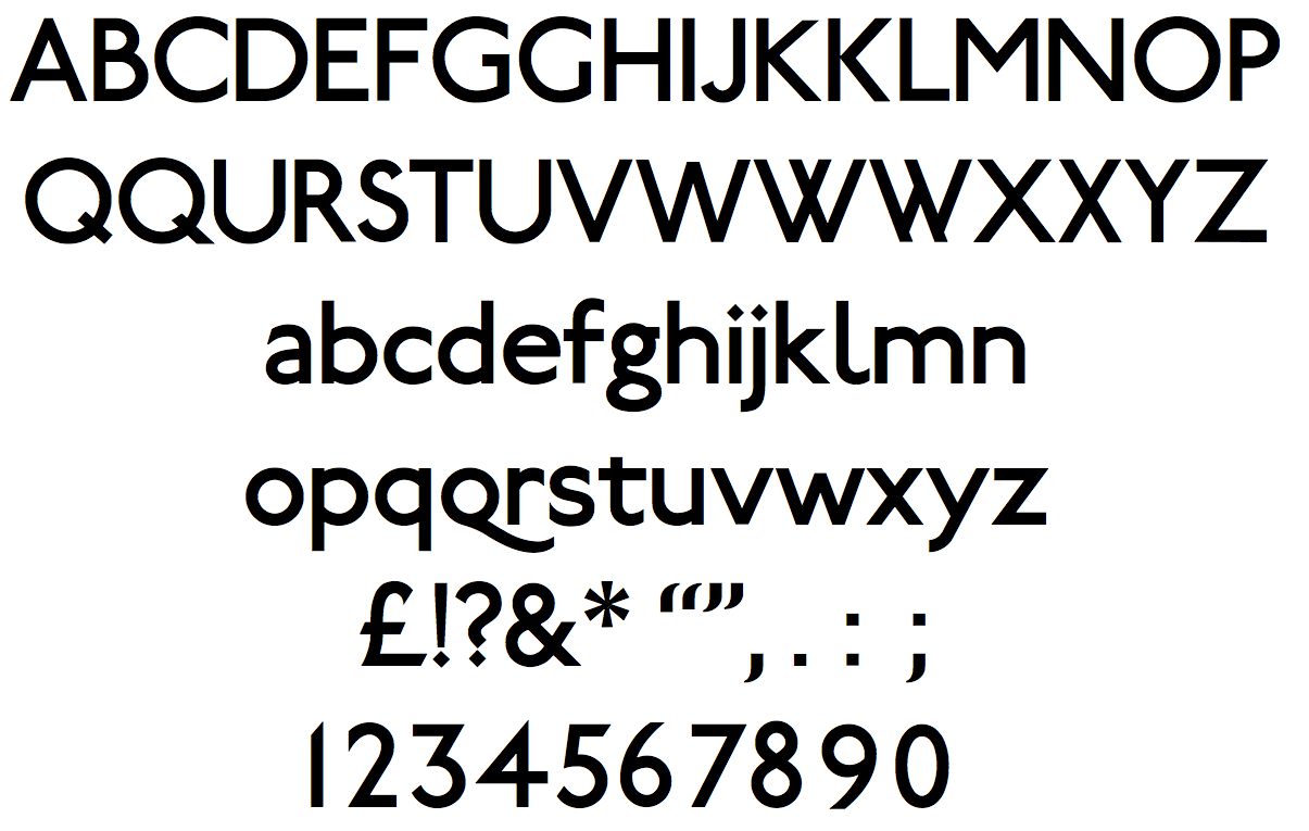
1916 - typographer was commissioned 'Edward Johnson' who Designed a new Typeface for the tube which was an eponymous face (names After Himself ) Johnson Sans. The plain block letters demonstrate almost no variation in stroke width. Created lettering that would be legible in the blink of an eye from a passing train. It was important to Johnson that the lettering provided the same sense of glamour and modernity that the abstract promotional poster emphasised.
The History Behind the London Underground Map and design
1907 - Introduced the Trade Mark of a solid red roundel. Which is a simple geometric design which was used to standardise the signage of the underground for example the Covent Garden Station shows how the red White and blue palette Appeared to a commuter. However there was little attention paid to marketing the underground in a constant matter
Edward Johnson
Johnson Sans
1918 - Johnson was commissioned again to update the roundel and expand on its possibilities as the basis of signage. Johnson updated the design by transforming the solid red circle into a white circle with a red band around it, a bulls eye. and both outlining both the redound and the bar that cuts across the roundel with a strong black contour line. The most important update was a change in the proportions between the bulls eye and the bar, making the former smaller so that it no longer visually overwhelmed the bar and lettering on it. He also added his typeface to the logo.
The reconfigured bull's eye was to be come one pf the most recognisable trademark ever invented.
Harry Beck
1930 - Harry Beck was commissioned to devise a simple but comprehensive map of the different routes. He based his work on diagrams of electric circuits, which use colour and geometry simplify a more complex and variable system. Beck created a map in between 1931 and 1933that displayed the tentacles of the system in a logical, predictable diagram
The map was first introduced as a leaflet, the finished map rapidly became one of the most famous examples information management ever divided
Beck successfully reduced the irregular layout of the system into a grid-based design that showed each route on a horizontal, vertical, or diagonal axis. Each station and interchange was clearly marked. Beck's innovation has proved to be a lasting one, as similar maps are still used in subway systems around the world.
The London Underground map 2016


No comments:
Post a Comment