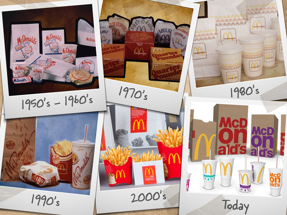
McDonald's has revamped their look the packaging for the different products they sell.
McDonald's last rebranded in 2013 which featured a frenetic collage of QR codes, slogans, illustrations, and symbols.
McDonald's doesn't have an in-house design team, so it invited 15 designers from eight agencies located in the European Union, the Americas, Asia, and Australia to an office in London to work on the packaging. Plans to revamp the graphics began in January 2015, but the actual design time was limited to one week. The team came up with initial concepts, interviewed customers about the proposals, then refined the design. During the process, they experimented with a number of ideas, from illustration-heavy mock-ups to ideas that riffed on food photography and various logo-based treatments.
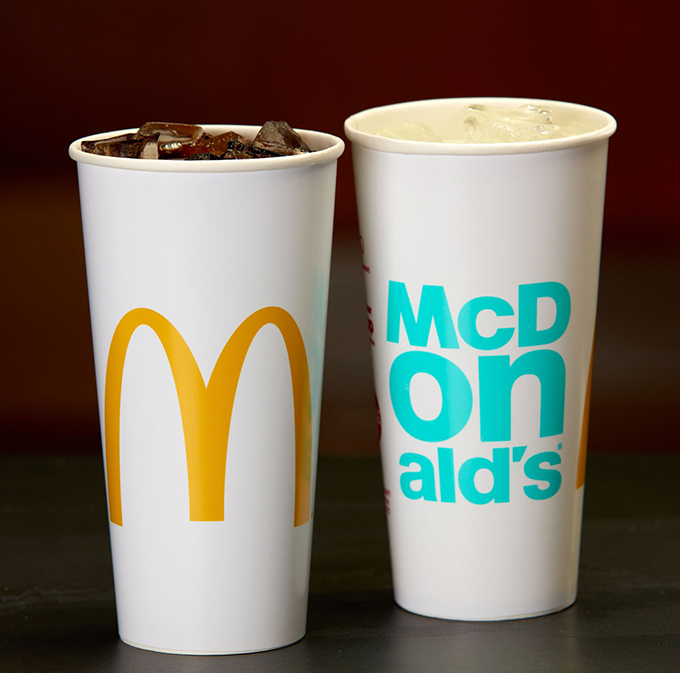
"As we went through the process and iterations and as we brought consumers into that process of co-creating the designs with us, more and more what we heard from consumers is be true, be bold, be McDonald's," Biespiel says. That led the designers to a type-based concept that uses the bespoke version of Helvetica that comprises the company's wordmark.
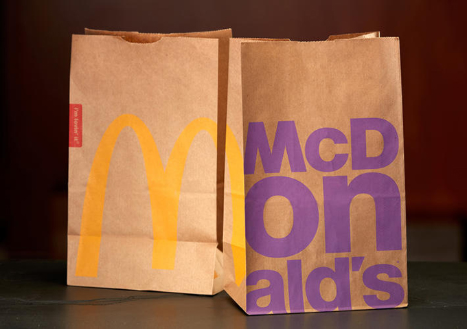
After establishing the core idea, McDonald's worked with the Chicago-based firm Boxer Brand Design to refine the design and apply it across all the packaging portfolio. Bags, cups, boxes, and their brethren are emblazoned with bright pink, acid greed, neon orange, red, and sky blue words central to the brand: McDonald's (naturally), Big Mac, Chicken McNuggets, Fries, and so on. The bags feature exaggerated golden arches that wrap around the front and side. The colors were chosen to relay that McDonald's is a "colorful brand," Biespiel says. More pragmatically, the colors also work with the existing supply chain by playing nicely with the brown paper bags, which are part of McDonald's plan to use 100-percent recycled fiber by 2020.

No comments:
Post a Comment