This week I went back to the beginning and used pencil to try and help motivate my self back into starting to enjoying life drawing again. I started the session not making meny measurments and found that my drawing was very stretched and out of proportion so for the second half of the session I used measurments and referneces to develop my life drawing.
First Half of the session.
Second half of the session.
by the end of the session my drawings was alto more in proportion, however due to time it was taking me to long to get all of the measurement, so for next week I will continue with the measurements and proportion with the intention that the more I pactice I will get quicker at the life drawing. hopeflly by the time it comes to portfolio presentations for university I will have a collection of strong final artwork of my life drawing.
Friday, 27 November 2015
Live Drawing Session 7
Labels:
Art,
art and design,
College,
Graphic Design,
Life drawing,
Live drawing,
model,
pencil,
portfolio,
University
Thursday, 26 November 2015
Alternative Miss World Research
Alternative Miss World
Theme - Letters and Numbers
For the theme I can use the letters and numbers to create a from of Typography & Monotype design
Visual Communication and Digital technologies: Produce a range of advertising and
design work that encourages an audience of your age range to become involved with the
themes relating to the AMW on a daily basis. This could include corporate identity advertising
and rebranding for the show; to sell costumes from the show; to sell the essence of the show.
From the brief I am going to rebrand the show and create posters of advertisement for the alternative miss world with the theme of words and numbers. So I gathered together previous show posters and looked at the numbers and letters used throughout the posters.
From the brief I am going to rebrand the show and create posters of advertisement for the alternative miss world with the theme of words and numbers. So I gathered together previous show posters and looked at the numbers and letters used throughout the posters.
Text that I would include on the poster would be:
Andrew Logan
Alternative Miss World
Date (March 2016)
Theme (Words and Numbers)
To present our design development to reaching the final design I will create a video scribing showing the different stages of my design development.
Below is a video from a trial I did for video scribing about Adobe CC
Labels:
alternative miss world,
Andrew Logan,
Art,
art and design,
College,
Graphic Design,
inspiration,
monotype,
poster,
rebrand,
Typography,
video scribing,
words and numbers
Location:
Worksop, Worksop, Nottinghamshire, UK
Alternative Miss World Brief
Brief Rationale
BTEC Foundation Diploma in Art and Design Level 3
Project Brief
“The Alternative Miss World is not about beauty - it's about transformation - and when it
comes to costume absolutely anything goes”......”It's about creative free-reign, about the
ordinary becoming extraordinary. Contestants over the years have been famous and
infamous, celebrated and unknown, a parade of freaks, fops, show offs and drag queens...
including Andrew's many friends and family!”
You are to use the theme of “Letters & Numbers” within the Alternative Miss World as a starting point to develop a body of work that extends your understanding of your Pathway subject.
Visual Communication and Digital technologies: Produce a range of advertising and design work that encourages an audience of your age range to become involved with the themes relating to the AMW on a daily basis. This could include corporate identity advertising and rebranding for the show; to sell costumes from the show; to sell the essence of the show.
Illustration / Animation / Games Design: Illustrate / animate an interpretation of the AMW through developing a narrative. This should include sketchbook, idea generation, character development and storyboarding relevant to the subject.
Fine Art / Applied Art: Produce a body of work as a response to the context of the AMW. This may be interpreted as you wish, responding to issues surrounding equality, gender and celebration of transformation. Where necessary the design and purpose of the work must be taken into account: public art, some applied arts.
Theatre studies: Develop and produce designs for your area of interest within theatre studies: Prop design, set design or costume design.
Throughout you should relate your work to current practitioners from within your pathway, theoretically, contextually and technically.
Wednesday, 25 November 2015
D&AD
The D&AD NewBlood briefs have arrived and after a lot of thinking and research into each of the briefs I am going to go ahead with the Adobe Brief where I have to remix the Adobe Creative Cloud Identity for future creators.
The reason for taking part in the D&AD NewBlood Awards is to challenge myself to create a final design that shows the best of my abilities and will be a great asset for my Portfolio presentation when I have my interviews for University.
Labels:
adobe,
art and design,
CC,
creativecloud,
D&AD,
Graphic Design,
illustrator,
NewBlood,
photoshop,
portfolio,
University
Location:
Worksop, Worksop, Nottinghamshire, UK
Tuesday, 24 November 2015
Contextual Studies #7
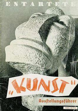
Degenerate Art
Degenerate Art promoted paintings and sculptures that were traditional in manner and that exalted the "blood and soil" values of racial purity, militarism, and obedience. "modern art" had no place in Nazi Germany.
At the time disapproved music was termed degenerate music (such as Jazz), films and plays also were censored.
In 1933 when Hitler rises into power he burned books an artists and musicians were dismissed from teaching positions, and creators who had shown partiality to modern art because hitler was trying to cleanse the culture of degeneracy
Bauhaus Was closed
Cover of the catalogue of the Nazi "Degenerate Art" exhibition (1937). The exhibition was held to defame modern and Jewish artists.
Nazi Poster entartete musik poster Degenerate Music
Jewish Composers and Jazz/Swing musicians were accused by the Nazis to produce "degenerated music"
Degernerate Art Exhibition - Munich 1937
Max Beckmann (February 12, 1884 – December 27, 1950) was a German painter, draftsman, printmaker, sculptor, and writer.
The Nazi government called Beckmann cultural Bolshevik an he was dismissed from teaching position at an art school
Max Beckmann Self-portrait with Horn, 1938-1940
Face moulding
Today using clingfilm and plaster bandage I created a mould of my face. Next I will create a plaster mould from the face plaster bandage mould and then cover the plaster in clay and then latex. to create a mask related to Alternative Miss World.
Labels:
alternative miss world,
Art,
art and design,
clay,
clingfilm,
College,
design,
face,
Graphic Design,
latex,
moulding,
plaster bandage
Saturday, 21 November 2015
University Of Derby Open Day
On Saturday I visited the University of Derby Open Day and found that compared to Sheffield Hallam and Nottingham Trent University the Art and Design section of the University was seperate from the main Campus. I also found that the Course is a rather small course in terms of course size where on average the cause each year has around 40 students on the course. The course is recognised by D&AD. from looking through the accommodation, prospectus and talking to one of the course tutors I believe that I could study at The University Of Derby In the future so i will be adding the University of Derby to be choices within my UCAS application.
Also Before I forget one of the university Accommodations has a Flat Cat which lives at the university all the time! How cool is that!
Friday, 20 November 2015
Live Drawing Session 6
This session is all about using digital, which i thought that I would be rather good at but it turns out I'm still not very good, and each week I am finding Life Drawing really hard and I don't want to do it anymore. However I need it for my Portfolio For university so the help me be more motivated I will conduct some research into measurements and life drawing in general and then start next week with an open mind and just use Pencil and Charcoal which are the only materials solar that I feel comfortable using.
Looking back through my life drawing sessions it looks like I am better using a stick that with material just in hand.
Looking back through my life drawing sessions it looks like I am better using a stick that with material just in hand.
Labels:
Art,
art and design,
College,
digital,
Graphic Design,
graphics tablet,
Life drawing,
Live drawing,
model,
pencil,
portfolio,
stick,
University
Tuesday, 17 November 2015
Contextual Studies #6
Bauhaus
Link to Pinterest
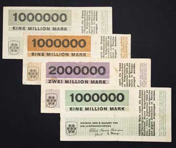
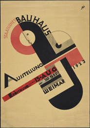
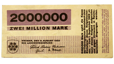
The Bauhaus was a school whose approach to design and the combination of fine art and arts and crafts proved to be a major influence on the development of graphic design as well as much of 20th century modern art. Founded by Walter Gropius in Weimar, Germany in 1919, the school moved to Dessau in 1924 and then was forced to close its doors, under pressure from the Nazi political party, in 1933. The school favored simplified forms, rationality, functionality and the idea that mass production could live in harmony with the artistic spirit of individuality.
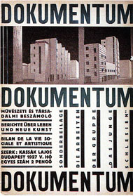
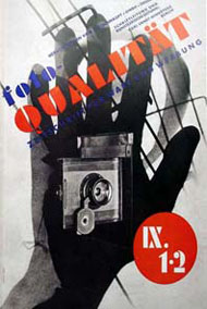
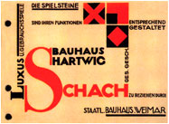
Along with Gropius, and many other artists and teachers, both Laszlo Moholy-Nagy and Herbert Bayer made significant contributions to the development of graphic design. Among its many contributions to the development of design, the Bauhaus taught typography as part of its curriculum and was instrumental in the development of sans-serif typography, which they favored for its simplified geometric forms and as an alternative to the heavily ornate German standard of blackletter typography.
Bauhaus Manifesto
Walter Gropius created the Staatliche Bauhaus in Weimar in 1919 from the merger of the Grand Ducal Saxonian school of arts and crafts, where Henry van de Velde was director until 1915, and the Grand Ducal Saxonian school of arts. Immediately after he took office as director, Gropius had a four-page pamphlet printed. He put Feininger’s Cathedral woodcut on the front page and included both the founding manifesto and a detailed teaching program in the content. This is where Gropius announced his school’s seminal aim: architecture, sculpture and painting were to lead back to the crafts. The name “Bauhaus” was selected for its allusion to the masons’ guilds of the medieval cathedrals, which combined art and craft in the collaborative undertaking, the “grand building”.

Cathedral
Feininger’s cubist woodcut, "Cathedral", was made in 1919 for the cover of Walter Gropius’s manifesto and programme for the Staatliches Bauhaus Weimar. Here, Gropius and Feininger referred to the “miracle of the Gothic cathedral” as a Gesamtkunstwerk (total work of art). The name “Bauhaus” subsequently evolved as an allusion to the medieval masons’ guilds.

Manifesto and Programme of the State Bauhaus
The Bauhaus’s incantatory ‘Manifesto’ formed part of the prospectus in which Walter Gropius presented the programme of the newly founded college of design in 1919, using Lyonel Feininger’s ‘Cathedral’ woodcut as the title image. The Bauhaus Director’s proclamation focuses on the need for the fine arts to be unified under the primacy of architecture and for a return to craftsmanship in order to reveal the ‘craft quality’ as the ‘ultimate source of creative design’.

Manifesto of the Staatliches Bauhaus in Weimar April 1919
“The ultimate goal of all art is the building! The ornamentation of the building was once the main purpose of the visual arts, and they were considered indispensable parts of the great building. Today, they exist in complacent isolation, from which they can only be salvaged by the purposeful and cooperative endeavours of all artisans. Architects, painters and sculptors must learn a new way of seeing and understanding the composite character of the building, both as a totality and in terms of its parts. Their work will then re-imbue itself with the spirit of architecture, which it lost in salon art.
The art schools of old were incapable of producing this unity – and how could they, for art may not be taught. They must return to the workshop. This world of mere drawing and painting of draughtsmen and applied artists must at long last become a world that builds. When a young person who senses within himself a love for creative endeavour begins his career, as in the past, by learning a trade, the unproductive “artist” will no longer be condemned to the imperfect practice of art because his skill is now preserved in craftsmanship, where he may achieve excellence.
Architects, sculptors, painters – we all must return to craftsmanship! For there is no such thing as “art by profession”. There is no essential difference between the artist and the artisan. The artist is an exalted artisan. Merciful heaven, in rare moments of illumination beyond man’s will, may allow art to blossom from the work of his hand, but the foundations of proficiency are indispensable to every artist. This is the original source of creative design.
So let us therefore create a new guild of craftsmen, free of the divisive class pretensions that endeavoured to raise a prideful barrier between craftsmen and artists! Let us strive for, conceive and create the new building of the future that will unite every discipline, architecture and sculpture and painting, and which will one day rise heavenwards from the million hands of craftsmen as a clear symbol of a new belief to come."
I am Currently Studying the Foundation of Art and design and the cause structure is based on the Bauhaus Manifesto
Owl
Today using the cardboard boxes we had to destroy the box and then reconstruct the cardboard box so after looking through images on Pinterest I came across an owl , which I thought I would have a go at creating using cardboard, buttons, tape and a peg, I created the owl shown below
I then went outside with my cardboard owl and took a picture of the owl in the plantation outside of college carpark.
To use the remainder of the cardbord box I am going to create a costume to wear of an owl to possibly wear for the sewhat event next year. I think I am going to take the owl idea forward and use it for the alternative miss world project.
Labels:
alternative miss world,
art and design,
buttons,
cardboard,
College,
Graphic Design,
Owl,
pegs,
Photography,
portfolio,
poster,
tape
Friday, 13 November 2015
Live Drawing Session 5
PAINT!
In this Weeks life drawing session we used paint and I personally think I am not very good at using and it was starting to frustrate me so I had to have a break and then went back to working with pencil.
For the painting I tried doing the the pop art effect using the red and blue dots for the shading like from the images I took when i visited London (London Blog Post) But I found the dots was to big.
Next week we are using graphic tablets and tables for life drawing!
Subscribe to:
Comments (Atom)


