Below is what I have to do for my Digital Portfolio for Nottingham Trent University
Your submission is an opportunity for you to showcase your work.
We would like to see 12 examples of your practical work and a piece of written work. These should be submitted
as two separate files.
FILE 1 – practical work
You should include a variety of work such as:
• observational drawing / painting / illustration; • research and idea development using analysis and visualisation;
• evidence of design process; • finished project work.
Please submit your practical work as a Microsoft PowerPoint or Apple Quicktime presentation. It should be:
• no more than 12 slides (to describe your process and how you develop ideas, you can include multiple images on
each slide, plus short descriptions);
• submitted as a single unzipped file not exceeding 10mb (megabytes).
Where images are inserted into a presentation they must be:
• in JPEG format; • a maximum of 72 dpi (dots per inch).
FILE 2 – written work
• UK / EU applicants
Please supply a short written summary (500 words maximum) of the work you are submitting. This can
include project briefs if available.
• International applicants
Please submit a piece of written work (from your current / previous course) to show the Admissions Tutors
how you express yourself in English (approximately 500 words in length). Please save your written work as a
Microsoft Word file.
This information is for those applying to join this course in September 2015.
This information is correct at the time of printing. Nottingham Trent University reserves the right to
change this information without prior notice or justification.
What we are looking for in your work submission
• Your ability to source design ideas from a range of research activities; • your use of a visible design process for idea development; • your willingness to experiment using a range of media, materials and technologies;
• skills in observational drawing; • effectiveness of final design outcomes and presentation of work; • the ability to express your ideas confidently in writing.
Today I went back to using a stick and charcoal for life drawing. Which I found that the change from working in my sketch book to working using a stick and charcoal for the session I have developed some more work for my portfolio for university.
Along Side the Being Human Project I will also be working on the Contextual Brief (Shown Below)
Personal Contextual Investigation
This project enables you to extend your understanding of historical and
contextual developments in relation to a particular time period and your own
chosen Pathway subject. It should also be seen as an introduction to your
research development for your Final Major Project.
You are asked to select a period of time that has been covered during the
introduction to historical contextual understanding sessions. You should
explore social developments that caused artists or designers to produce work
in the manner that represents ‘Art Movements’ from the chosen timescale.
• You should choose an area of art or design that relates to your own chosen
Pathway subject and produce an individual written investigation of 1500
words.
• Your written work should be complimented by a creative presentation to be
devised with a partner from your group who has a similar pathway subject
interest. You will be required to present a combined summary of your
research findings that both entertains and informs other members of the
group
As the alternative Miss world Project draws to a close today I have been given the next brief that I will be working on in the upcoming weeks. Project Brief
Being Human (Mock F.M.P.)
This project offers you the opportunity to consolidate your existing skills, and
extend your visual research through life drawing, alongside your investigation
into relevant historical and contextual understanding.
You should consider extending the way in which you interpret the above, in
terms of conceptual thought, structural elements relating to life drawing and the
relationship of the figure to your subject area. As a starting point you should
work towards the following:
You have been asked to participate in an arts festival. The festival theme is
“Being Human” and will celebrate the diverse creativity within the local area.
The guidelines given for the festival are very broad, and essentially ask that
each artist or designer remain true to their own vocational context, in order to
ease the planning and mapping of the experience for visitors.
Therefore, you must produce a body of work that demonstrates your
knowledge, understanding and ability to work within your chosen career path.
In order to do this, you must submit a proposed rational, brief and time-plan for
the festival organisers.
After submitting my UCAS application on the 15th of January. I received acknowledgement off each of the universities saying that they had received my application. And then the waiting game started.... On the 21st of January I was sent an invite to an interview on the 30th of January at the University Of Derby. However due to work commitments I have had to rearrange the interview. I am currently waiting for Derby to reply to my email. On the 22nd Of January I have been invited to a selection day at Sheffield Hallam University Which will be held on the 16th of March Yesterday 28th of January I have been asked to Submit an online portfolio for Nottingham Trent University which needs to be submitted by the 11th of February. However other then the acknowledgement of the University of Lincoln that they have received my Application I still haven't received anything yet.
For my Mobile application I had to come up with a name for the application and then design a logo and the artwork for the application. After thinking of a name I came up with Loci because the application is about locations (LOC) and about locations you have visited making it personal to the user (I). After Filling two layout pads I looked at the locations marker and looked at making the text the outline of the location marker which looked like this:
I then used the logo and a section of the Worksop road map to design the artwork for the application.
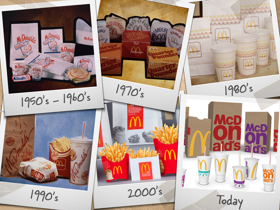
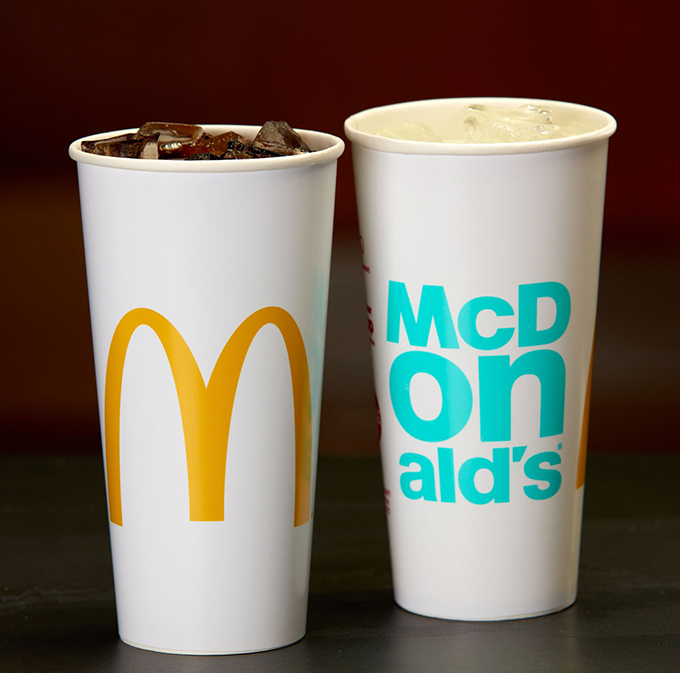
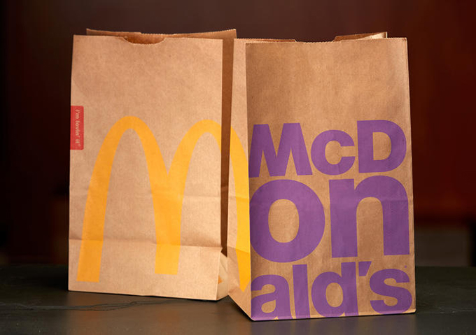
McDonald's has revamped their look the packaging for the different products they sell. McDonald's last rebranded in 2013 which featured a frenetic collage of QR codes, slogans, illustrations, and symbols.
McDonald's doesn't have an in-house design team, so it invited 15 designers from eight agencies located in the European Union, the Americas, Asia, and Australia to an office in London to work on the packaging. Plans to revamp the graphics began in January 2015, but the actual design time was limited to one week. The team came up with initial concepts, interviewed customers about the proposals, then refined the design. During the process, they experimented with a number of ideas, from illustration-heavy mock-ups to ideas that riffed on food photography and various logo-based treatments.
"As we went through the process and iterations and as we brought consumers into that process of co-creating the designs with us, more and more what we heard from consumers is be true, be bold, be McDonald's," Biespiel says. That led the designers to a type-based concept that uses the bespoke version of Helvetica that comprises the company's wordmark.
After establishing the core idea, McDonald's worked with the Chicago-based firm Boxer Brand Design to refine the design and apply it across all the packaging portfolio. Bags, cups, boxes, and their brethren are emblazoned with bright pink, acid greed, neon orange, red, and sky blue words central to the brand: McDonald's (naturally), Big Mac, Chicken McNuggets, Fries, and so on. The bags feature exaggerated golden arches that wrap around the front and side. The colors were chosen to relay that McDonald's is a "colorful brand," Biespiel says. More pragmatically, the colors also work with the existing supply chain by playing nicely with the brown paper bags, which are part of McDonald's plan to use 100-percent recycled fiber by 2020.
After Creating my Coffee cup and t-shirt design I then thought about designing a mobile application for the Worksop Road Map. I started looking on google on how to design a Mobile application.
There's an invisible grid on every surface. You may not see it, but it's there to guide you.
02. Every element defines the spacing
Place an element on your canvas and you are starting to define your spacing
The moment a dot, a word, a line is placed onto a canvas/monitor/screen, you have defined your margins and padding. Every stroke defines the space you have to work with.
With that, make sure to maintain consistent widths and heights with the margins and padding. Sixty pixels in one place and 20px in another had better have a good reason behind it (like one section is a child of the other). Otherwise, all should be the same.
03. Colour creates hierarchy
Even shades of grey can create hierarchy
Colour value is used to denote purpose. Let's start with black and greyscale. If you make one button black, the next dark grey, and the third light grey, what you are in effect saying is this: "Button one is most important to the visitor, button 2 is less important, and button 3 is least important."
Colour defines customers' relationship with a brand in subtle yet effective ways
Try not make the button colours the same colour as the site or app, as it will fade away. Also, a good tip is to avoid creating "buy" or other call to actions buttons in a bright red – as that means stop in the US, and may actually prevent users from clicking it, often thinking it won't get them to their goal (see image).
Never underestimate the power of cultural conventions when it comes to colour
This brings up the next point which is that colour associations are culturally based and should be considered when defining the market. For instance, I once worked on a team that had the main 'access' button as red which we later changed to green and increased clicks twofold.
Red can mean, "stop, don't do it, are you sure? warning!" being aware of this will help you get results closer aligned to your needs.
04. Colour is not about you liking it, it's about the brand
Brand is focused on the emotional relationship you consumers or customers have with your service or product. Colour helps define that relationship in subtle yet effective ways. You don't have to like your colours for them to be effective.
05. Pink is not a shade of red
Learn the meaning behind 'shade' and 'tint' as I will be all over you for misusing it in conversation.
Colour 101: Hue is the base colour, like red, blue, green, etc. If white is added to a colour, it is a tint of that colour, if black is added, it is a shade of that colour. Got it? Thus when describing the colour of something it may have a red hue and be a shade or a tint but not both at the same time. What about Canary you ask? That's a marketing colour name used to inconsistently refer to furniture or nail polish.
I use colours like 'Robins Blue,' 'Pumpkin Pie,' and 'Baby Vomit,' when speaking with clients because it humanizes colours and gives then an appropriate association - but when speaking technically - use the words shade and tint.
Oh, and what's Baby Vomit you ask? That's a colour I've been seeing creep up in logos as of late. I've always thought it couldn't get worse when a client insist on using Corporate Blue. Well, it sure can. The new villain is Baby Vomit.
06. Logos add style but they don't make or break
A brand makes the client as much as the client makes the brand. A logo isn't going to make you a great business: but a poorly executed and thought out logo will reflect poorly on your business.
One of the things people say is that a logo is timeless. By default, design is trendy, therefore a logo cannot be timeless. Logos are stuck by the age they were created in. There's nothing wrong with that. CocaCola isn't timeless - it very much feels reminiscent of the 1920's - around the time it was designed. It's been updated to a clean vector since then, helping it feel appropriate to our sensibilities, but the essence is vintage - not modern.
07. The page title
Your user can easily get lost so...
Screen titles on websites are excellent ways to remind the user of where they are after they opened 35 tabs and don't recall the content.
... consider adding a page title to remind them where they are
In apps, they take up precious space, and real-estate here is more expensive than in Manhattan, so if you think your user won't forget which screen they're on, you can sometimes skip it, or have it disappear until refresh or scroll.
Alternatively, this space can be transformed into a search area when the user needs that function. (Although, titles do frame the screen well, and can give the design a polished look.)
08. Define elements, then repeat them
Keep your visual elements consistent throughout
If one of the 'go' buttons is the colour purple, then all 'go' buttons should be the colour purple. If one screen has 20 px padding on all side, all screens should maintain this consistency.
This is what we mean by defining elements and repeating them. Each element should be defined, as should the colours inside the app.
09. Simple tricks can be used to separate text and create hierarchy
Keep your text styles consistent throughout
All caps, title case, indent, contrast, and underline: these are all stylistic choices. None are necessarily better than any other and you can use them in any place as long as you are consistent.
10. Outdated is another word for not trendy
The left screengrab shows flat desin, the right screengrab skeuomorphism
Design is focused on trends, and currently, the trend is to move toward a more flat design. Flat design does not mean it has no texture or shadows, nor does skeumorphic mean that every aspect should have a realistic texture. Generally you should be aware of what your audience will expect to see, as they will judge you for it. If your app looks outdated – users will note that.
"Skeuomorphism is a catch-all term for when objects retain ornamental elements of past, derivative iterations - elements that are no longer necessary to the current objects' functions." (Austin Carr - design and technology writer for Fast Company)
11. Most apps are basically just lists
These apps are basically just lists; the job of the designer is to make them look like something more interesting
The majority of mobile apps (that is not a game) are basically a way to navigate lists. The job of the designer is to hide the fact that it is just a list and make it an interesting experience that is both rewarding and fun. This is why IA and proper hierarchy is so important – with the right foundation, the layout can be very varied yet convey the same information.
12. How to make a decision on a layout
Design libraries exist to help decide which layout is the best for a particular problem. Here are some good ones.
Users have an expectation that their phones will respond quickly, and efficiently to all their interactions. This isn't always the case, and developers frequently tell me that certain interactions take a long time. So you may have to find a way to fake it.
Every interaction should have feedback. For instance, when a user action (swipe, tap, click) is responded to with an animation, this gives the user feedback that they have been heard and their process is being executed on.
Think about how it works in web design: when a user hovers over a button, it changes, and then again, on click, it changes. This should occur in mobile as well. If the user refreshes, there needs to be a moving symbol. If they hit something, it should slide, or glow, or bounce – anything to let that user know that it is working.
This also gives the system time to process the original interaction or call, making it appear like it was instant. In short, a lot of interaction design is smoke and mirrors.
14. Postpone sign up
Offer sign up on one page. Have the user signup once they 'like' or 'heart' an item; allow them to get engaged first. You'll have significant user dropoff from logins, and usually the sign up doesn't offer much value to the brand anyway.
15. When to use a fancy font
Choosing the right fonts is vital
When designing comps, time can be better spent elsewhere. Most people quickly distinguish between serif, sans, decorative, or condensed but frequently think slab is serif, humanist is sans, and anything Jessica Hische is decorative. The most important considerations for selecting a font are:
Can I easily use it on mobile/web?
Is there a variety of weights?
Is it legible?
I subscribe to the belief that type design takes a lifetime to master, so if you pick a type from a good foundry, there shouldn't be much of an issue.
With your mobile apps, keep in mind that a good number of users cannot distinguish between Arial, Avenir, Roboto, or Helvetica. This means that as long as the typeface is clean and easy to read, your'e ok. The time to add in a more complexly flavored font is when you're focusing on brand, and less on usability. In this case, the new, atypical font will create a feeling of being somewhere, perhaps nostalgia, maybe even whimsy. Whether or not you do this is based on your decided priorities, but it isn't something to get hung up on.
16. Each system has visual guidelines
Users are familiar with big brands' design guidelines, even if they don't know it
Android, Windows and iOS have design guidelines that cover different design styles and are rather detailed with specific information like widths between text. They're a great resource when you're not sure how to proceed.
Which lead me to the website listed below where I got free design resources which I will use to create my mobile application.
http://www.interfacesketch.com - This gave me svg files of different electronic devices which are the correct dimension which can be edited in Adobe illustrator
http://appicontemplate.com - This gave me a PSD file for Adobe Photoshop where I will be able to design the artwork for the mobile application.
Confectionery brands Maynards and Bassetts have been brought together under one identity to form a new “adult candy” brand.
The newly formed Maynards Bassetts brand is operated by Mondelez International and features confectionary including Wine Gums and Liquorice Allsorts. The new Maynards Bassetts masterbrand has been created by Bulletproof. Bulletproof are a design agency based in London, New York and Singapore. They have also designed all the packaging for the new brand.
Bulletproof has created a new Maynards Bassetts “plaque” that can sit on the packs. The consultancy describes the new plaque as “a conduit where the intrinsic values of the products tumble in through the top and out again, turning into a wonderful, colourful and dynamic flavour slide that delivers the sweets or characters, such as Bertie, in a dynamic and exciting way.” As well as redesigning the packaging for existing Maynards Bassetts ranges, Bulletproof has also created designs for a new product – Bertie’s Jelly Mix. The new packaging is set to roll out next month.
From designing the Worksop road Map I then looked at different merchandise that has been created for the London Underground and came across a mug, scarf, bedding and a phone case.
After looking at these images I designed a Coffee Cup Design and a tshirt design.
I got the idea from a Costa Coffee cup which I had earlier that day so I used Adobe Illustrator to design the layout of the cup from my design that I had recorded on a layout pad.
Here is the layout I designed in Adobe Illustrator
This design I then transferred into a mock up of the Coffee Cups showing what the design would look like if it got printed. For the background I used a cropped image of the worksop map.
I then designed a t-shirt design. I first designed the t-shirt on a layout pad and then used a mock up to show what the t-shirt would look like if it was printed.
To design something different I will now look into how to create and design a Mobile application.